Tagged: paintonmywalls

How to Mix A Variety of Greens

Mixing Greens Demo

We all know that yellow and blue make green. But what type of green you want determines which blues and yellows you will start with. The demo in the video below is done with oil paints, but it would hold true for acrylics as well. In this video, I show the different greens possible using 5 paint colors: Cerulean Blue and Ultramarine Blue, Yellow Ochre, Cadmium Yellow Deep Hue, and Lemon Yellow.

Leaning Colors

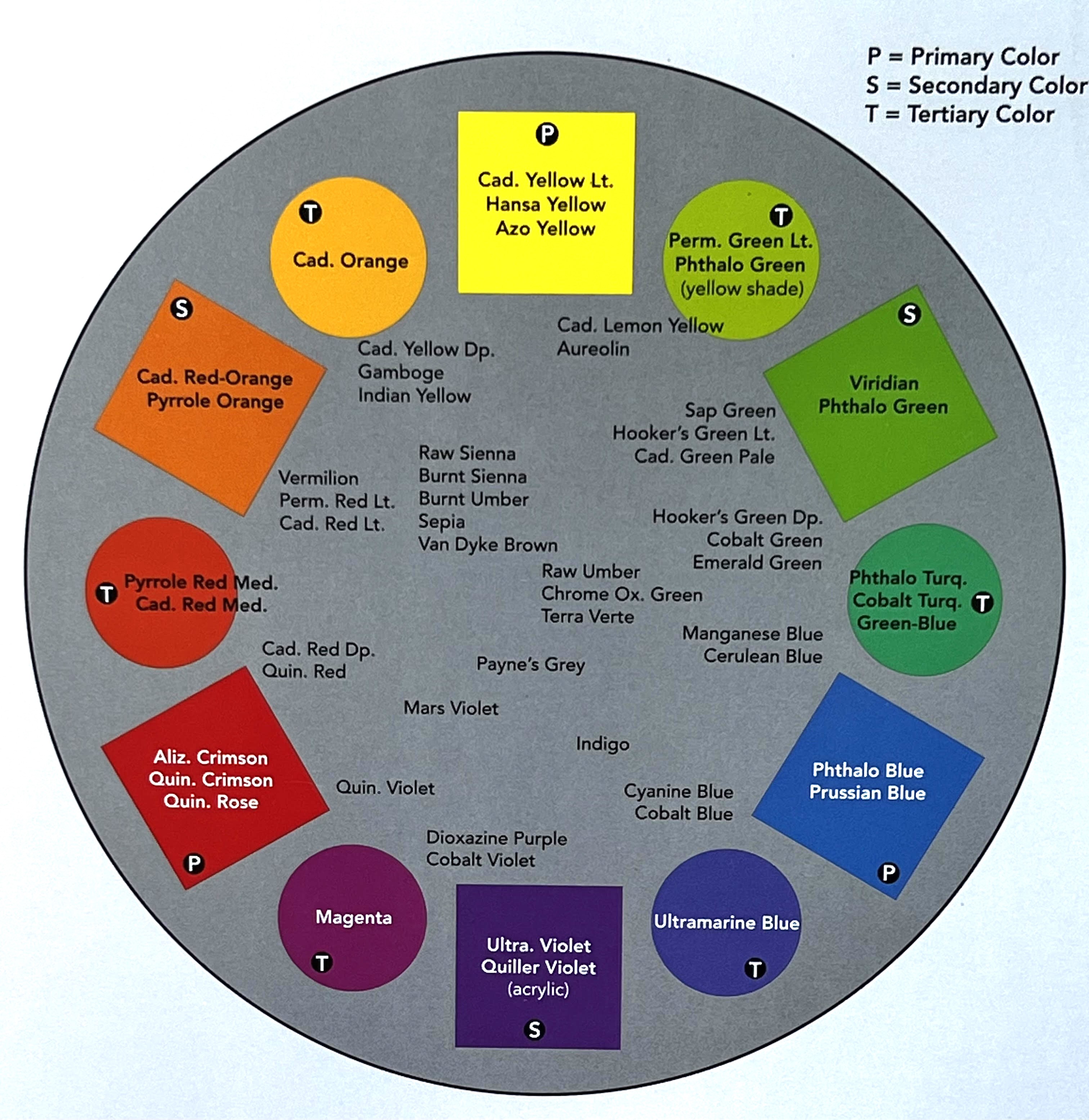
That is not a typo. I’m not talking about “learning” colors, but “leaning” colors. If you visualize a color wheel, there are several blues, several yellows, and several reds and each of them leans a little bit more to the analogous color or the color next to them. In the video, I mention that some blues will lean more toward either purple or green. Those are the two colors adjacent to blue on the color wheel. If I want a very vivid pure green, I’m going to select a blue and a yellow that lean toward green. If I want more of a dull green, like olive, I’m going to select a yellow and or a blue that leans away from green. The reason for this is that they will have more red in them which is a complementary ( or opposite ) color. In the color wheel below, the complementary color combinations are Red and Green; Cadmium Yellow and Violet; Orange and Pthalo Blue; Yellowish Green and Magenta. If I have a tube of Ultramarine Blue and a tube of Cerulean Blue and I want to make a vivid pure green with Lemon Yellow, I’m going to choose the blue with the most green in it…or the blue that leans more toward green which is the Cerulean. However, if I’m trying to make a dull more olive green, I’ll go with the Ultramarine. This is because the Ultramarine has more red in it and leans in that direction instead.

Out of the colors in the video demo above, Cerulean Blue and Lemon Yellow both lean toward green. Ultramarine Blue leans in the opposite direction toward Violet. Cadmium Yellow Deep Hue leans in the opposite direction toward Orange. Yellow Ochre leans toward Deep Orange or Brown away from green as well. If I am painting and I want a duller or olive or almost brown-green, I’ll use blue and yellows that lean away from the green. If I want a vivid, pure green, I’ll use colors that lean toward it.

color wheel

What if I want a beautiful vivid purple? Which tube of blue leans more toward red? The ultramarine. I’ll cover that in a different post.

The Color Wheel

Most color wheels you buy from art supply stores are not going to have the actual tube paint names on them. They are helpful for understanding color theory. However, I prefer to just keep this “leaning colors” idea in my head while I am painting.

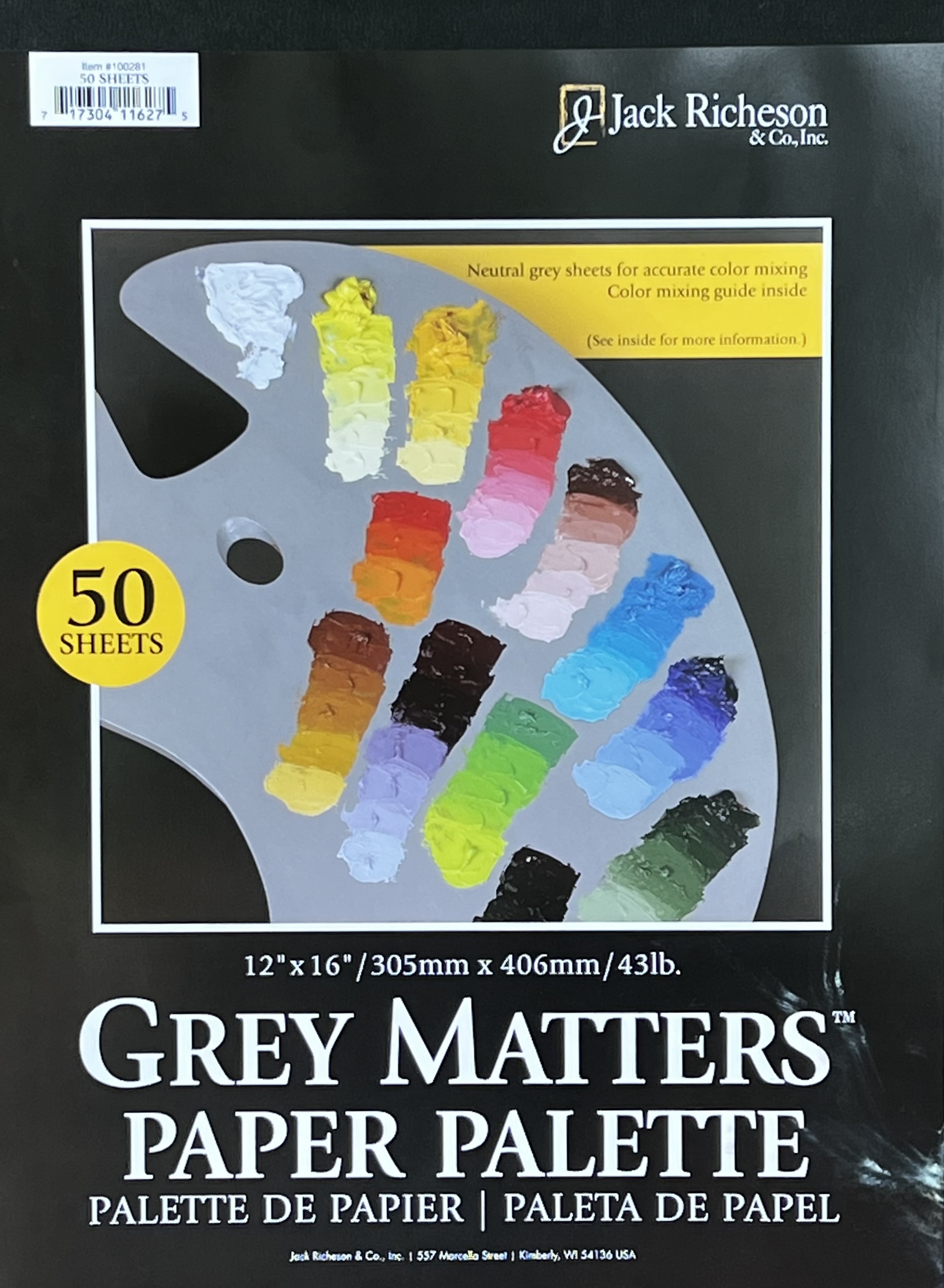
If you like the color wheel above, I actually got it for free in this disposable paint palette pad! I purchase the Grey Matters Paper Palette pads to mix my paint on and believe it or not this color wheel is on the inside cover of the pad. These are a great size for mixing paint on and toned grey to help you get the correct value in your mixes. I love the convenience of just being able to throw away my page from the pad when I am finished. Or, if I’m not finished, I can fold it up into a ziplock bag and save it in my refrigerator until I’m ready to paint the next day. You can find these at your favorite art supply store or in the link above on Amazon. It’s a great product with the perfect color tool included.

For more posts about classes or how to create art click the Classes tab at the top of the page. Be sure to subscribe and follow for more color-mixing demos coming soon!

Sea Turtle Progression

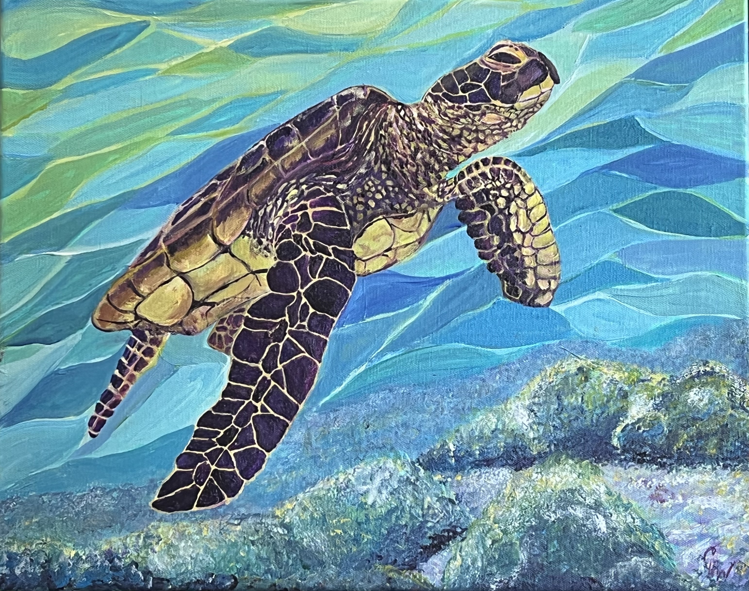
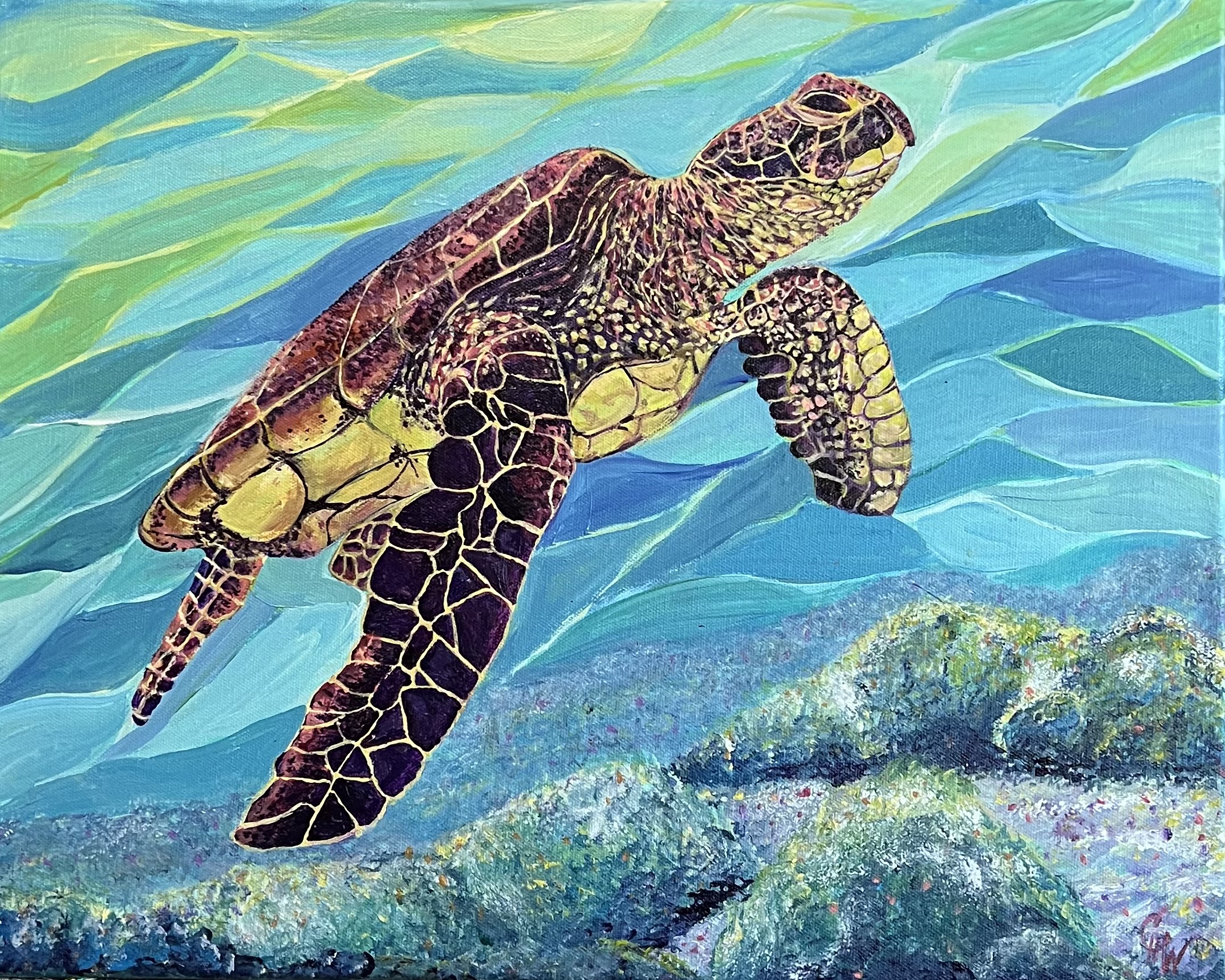
How painting a Sea Turtle showed me the value of mid-tones. This was a commission from a friend who absolutely loves Sea Turtles. I love them too but this was not a subject I would have chosen because of the detail involved but I dove into the challenge.

As the painting progressed I focused on the darkest and lightest values during the entire process. At the suggestion of my wonderful artist friends in Art Kula, I finally added the mid-tones at the end.

The video below shows the Sea Turtle progression from start to finish. You will notice how heavy the turtle looks until the final frame and how the background seems dull. This is an excellent example of why dark, light, and middle values are all necessary for a piece of art. As soon as the highlights of pink and lighter purple are added the entire painting pops and the background looks brighter. and the turtle actually looks like He is swimming free, which is the name of this painting.

Swimming Free, Acrylic on Canvas, 16″ x 20″, SOLD

I can’t say I am eager to do another sea turtle or any reptile with scales any time soon, but it is quite rewarding to see the finished turtle swimming free.

Beach Therapy for An Artist’s Soul

Beach Therapy

Beach therapy happens when you step out of the stress and pressure of your daily life and plunge yourself into days of rest at the shore of the ocean. Beach Therapy for an Artis’s soul happened by allowing myself to embrace the actual Creator of this beauty and explore more deeply what He is like. Looking at the expanse of the horizon and the power of the ocean, I encountered God in a posture of wonder and awe. The entire experience was a gift.

Ocean Inspiration

There is so much to love about the ocean. The rhythm of the waves and tide, breathing in the sweet clean air, the banquet of varied blues which is a feast for the eyes. As I soaked my body in the healing salt water, inflammation and pain melted away bringing refreshment to my aching joints and tired muscles. A one-hour massage on the beach also helped. In the midst of the needed rest, I found my mind was swirling with inspiration to paint the nature and beauty rolling out in front of me.

Three Birds on the Beach

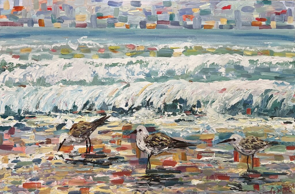
Launching from this fresh inspiration, I am posting the first of several beach paintings I am planning to do now that I am back home. This one is done in acrylic on a large 36″ x 24″ canvas and titled Three Birds on the Beach. The spots of color randomly sprinkled through the piece remind me of confetti, the rays of the sun, and the sparkles of light on the water. It’s a celebration of the color, light, and life that soaked deep into my soul on each day of my beach therapy.

Three Birds on Beach, oil on canvas 30x40 inches 500.00
Three Birds on Beach, oil on canvas 30×40 inches 500.00

Therapy for my Soul

The photos, memories, and little bit of sand I brought home with me were beautiful and did nourish and replenish me. However, the true therapy happened as I considered God and how mighty and loving He must be to have made such as thing as the ocean. The time I spent soaking it all in showed me more about who God is and what He must be like. John Piper explains this way better than I can so if you are curious about how being at the ocean reflects the character of God check out this powerful video.

What must God be like?

Have you ever done a search about how many references to the ocean and waves there are in scripture? It’s amazing. What must God be like is a question we could spend a lifetime trying to answer. That’s an invitation friend!

When we look at oceans or mountains, whales or bears, fields or deserts, God wants us to see the beauty, power, and wisdom in his creation and think, “What must God be like!” He wants us to ride the waves he has made into worship, and climb the mountains he built to see more of him.

John Piper

I can’t answer the question of what God must be like for you here in one blog post or a single painting, but next time you are at the ocean, soak it in and relish in the wonder. Be curious and explore and if you can’t get to the ocean soon, just ask Him the question where you are. He is always listening and He will find a way to show you.

Mixed Media Collage Roosters for Spring!

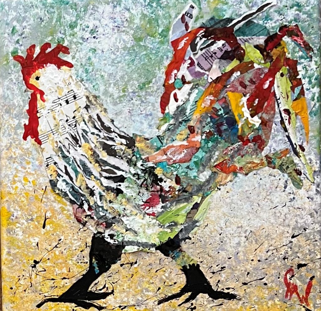
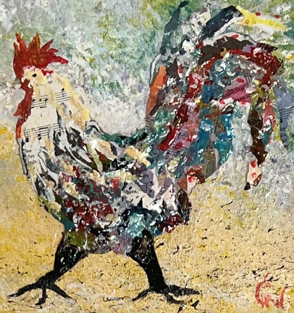
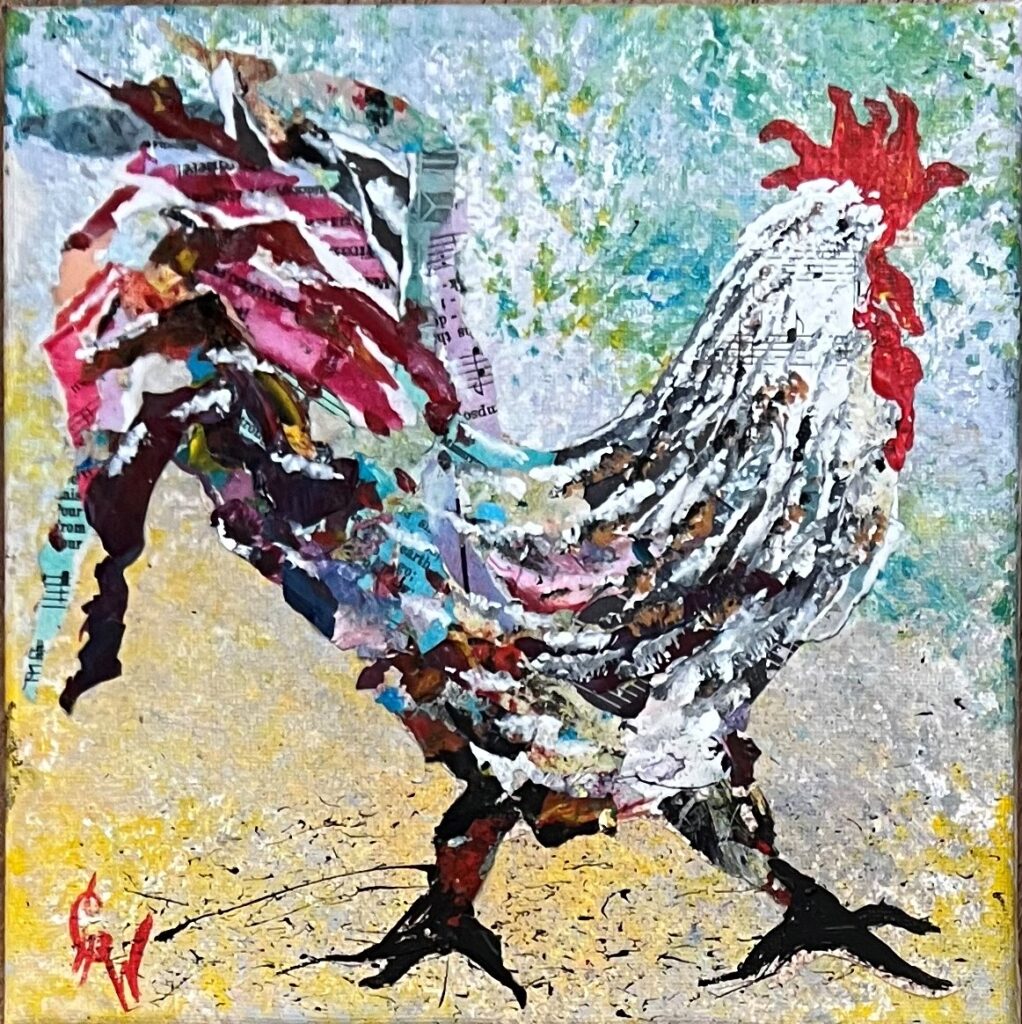
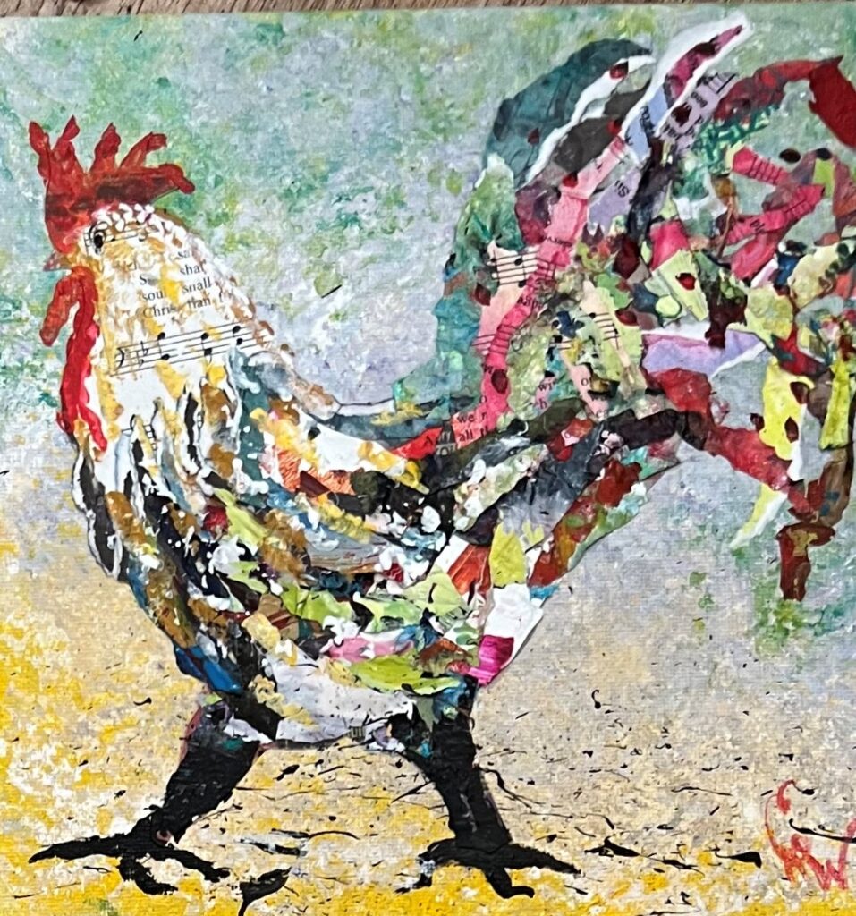
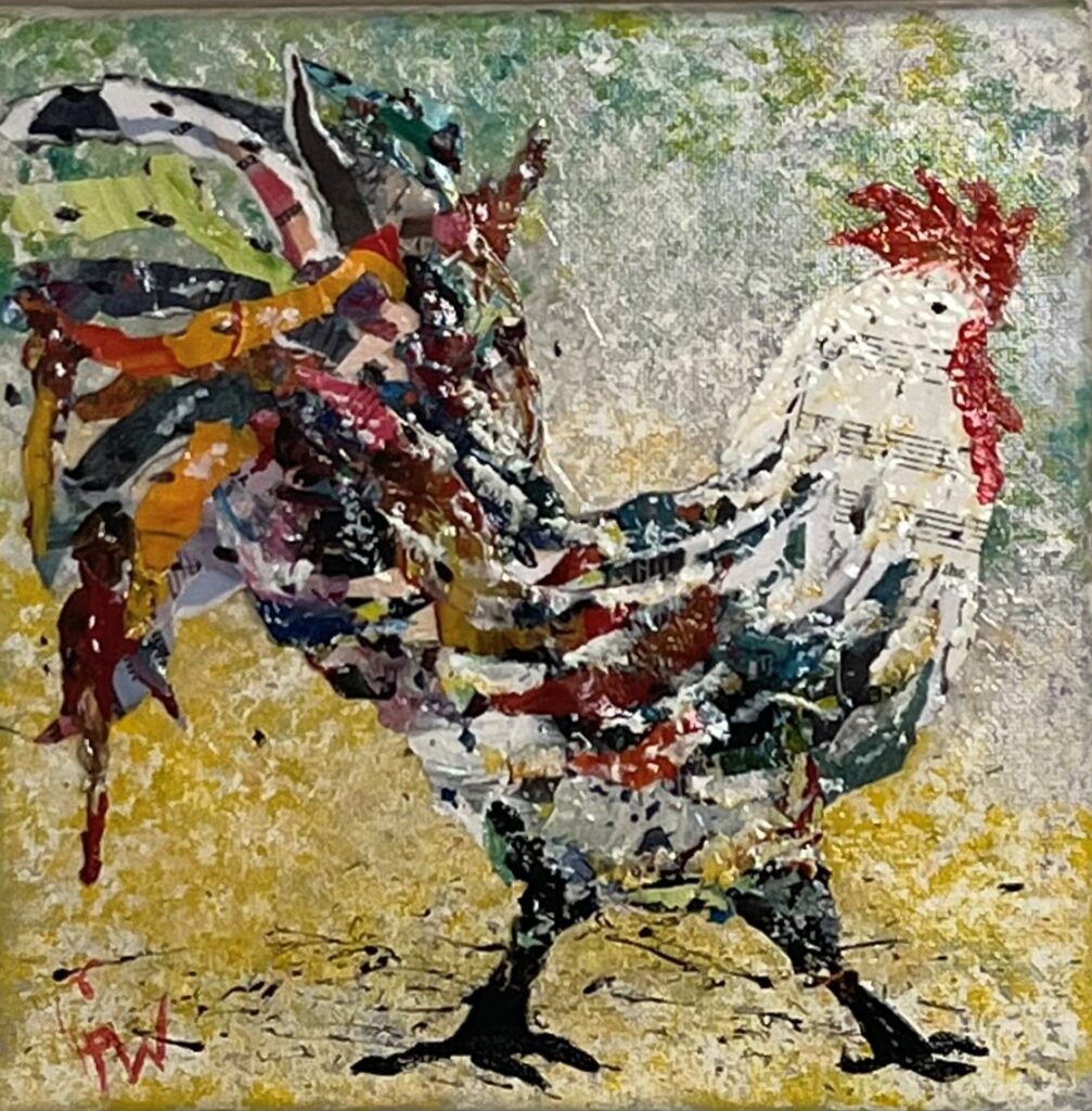
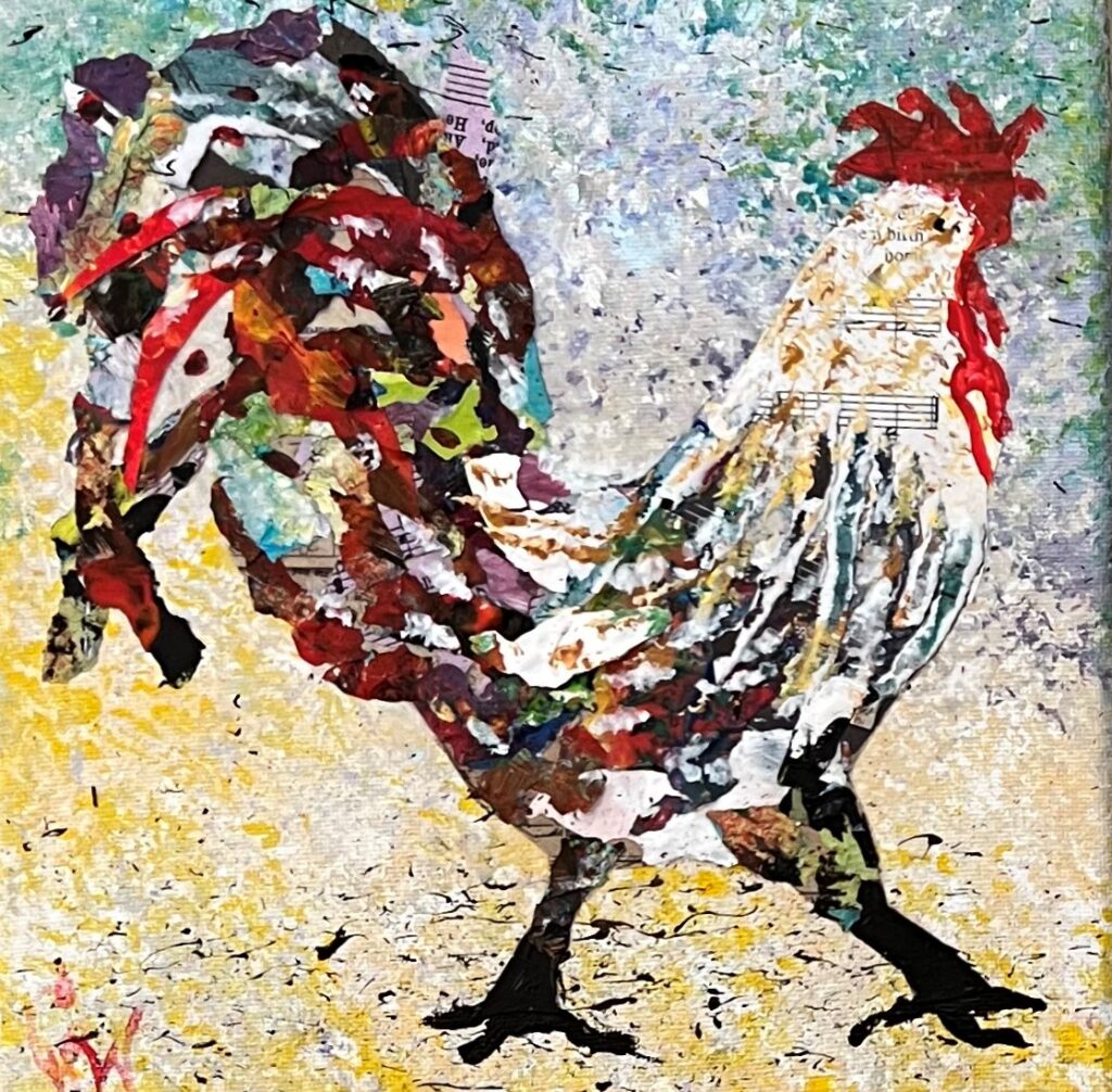
Collage is one of my favorite mixed media techniques to use when making these fun spring roosters. Using fun spring colors and various materials make their strutting attitude pop and grab your interest.

Creating these fun fancy spring roosters does take a lot of time and layers of materials, but they are well worth it and one of my best sellers at art sales and shows. Some of the materials used are hymn book pages, colored scrapbook acid-free paper scraps, or any other interesting torn paper and dried acrylic paint that I peal up off of a palette. This is my favorite thing to use for the feathers because the torn dried paint lends itself perfectly to that shape and it is never just one color. The pieces are assembled and glued to the canvas using Matte Modge Podge.

Meet some of my mixed media rooster stars.

Top Left: Clarence Top Center: Daisy Top Right Farah

Bottom Left: Florence Bottom Center: Gwendolyn Bottom Right: Spurgeon (SOLD)

Some of these are still available for sale. Check out the art for sale page and contact me if interested.

How An Artist Thinks About Creating Something New

Begin!

An Artist thinks about creating something new as an opportunity to embrace the unknown with courage, explore ways to learn from mistakes and discover the adventure of beginning. As an artist, staring at a fresh, blank canvas can feel exciting and intimidating at the same time. Expressing creatively through art can be a life-giving process, sometimes wrought with pain, but never as painful as not taking the first step. Whether starting a new blog, an art project, or any new endeavor, we begin, when not beginning becomes more painful than staying where we are. At some point, we must begin moving in a new direction.

Let’s just give it a go, shall we?

Take Courage!

Creating something new is like giving birth in a way. It’s an intimate expression wreathed in pain and vulnerability bringing forth new life. Painful, because the struggle requires sacrifice with no assurance of success. Vulnerable, because it is an expression of who we are outside of ourselves for others to either value or devalue. These are reasons why creating art or doing anything new can be quite a fear-inducing process, but they are not reasons we should not try. An artist thinks they are just reasons courage is needed to try.

A dear friend of mine once challenged me to change my thinking pattern about trying something new from “it could be a win or a fail”, to “it could be a win or a learn”! Our failures and pain can be excellent teachers.

Even the most successful artists face failure, rejection, or pain at some point. A perfect example of this is Henri Matisse. A master printmaker, sculptor, and painter, he overcame great suffering and loss in life and yet created some of the most vibrant innovative paintings and collages in history. Quoted as saying “Creativity takes courage” he did not view painting as a means to an end, but rather as a creative adventure in the expression of lines and color.

For examples of work by Henri Matisse, click here.

Explore!

The goal need not be getting to a destination or producing the perfect piece of art. How adventure-squashing would that be? Embrace a learning mindset. How about exploring some new ways to express creatively, grow in artistic ability, and encourage one another in the journey?

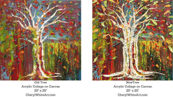
As an example, the left painting below was one I completed many years ago and considered a failure. What was needed was a contrast in the trunk and more energy exploding from the branches like confetti. Years later, the added torn hymn book pages and bright pieces of dried acrylic paint added the life and contrast needed to create the New Tree, Acrylic Collage with hymn book pages piece.

Creating Something New, Acrylic Collage, Trees, Art, Old Tree, New Tree,
Before and After Acrylic Collage renewed to new life. There is more about using hymn books in collage here.

Discover!

There is freedom in embracing creating something new as a process or a journey to discover rather than a final destination. Instead of striving for the perfect result following the shortest distance between two points; being open to the idea that when mistakes happen, they can teach us something is valuable. An adventurous mindset prepares us to notice unexpected treasure along the way and avoid the temptation to quit when the unknown looms ahead of us.

When you see someone putting on his Big Boots, you can be pretty sure that an adventure is going to happen.”

A.A. Milne, Winnie-the-Pooh

The best encouragement anyone has ever given me as a beginning artist was to just never quit. That’s the win and where all the learning happens.

Create!

It is my hope in this endeavor to help others do just that…to join in the dance breathed into mankind from the beginning of time. The Bible reveals God as the entire world’s ultimate creator, “So God created man in his own image, in the image of God he created him; male and female he created them.” Genesis 1:27

This verse reminds me that since God created everything we see with a word and formed man with his hands out of dust and breathed life into us, His image-bearers, that we too are able to create. Realizing I have this gift within encourages me…and if you are reading this, I believe the gift is inside you too and hope it encourages you as well. Whether you believe we are created by God or not, the “able to create” part of being human is too precious not to explore and too full of potential not to try. It’s my hope with this blog to embrace that creativity and to nurture and celebrate it as we journey together.