A Study of Springtime by Claude Monet
Completing studies of paintings from favorite master artists is an excellent practice.
I have not done this for several years but is such a wonderful exercise. I plan on doing more of these soon. The benefit of doing this every so often is that the artist has already set the composition and chosen the subject matter which are very time-consuming steps. I try to follow that as closely as possible when I do a study and imitate the same color palette as much as I can. Then, I let go and have fun. It’s not important to stress over every brush stroke and detail because I’m not doing this to sell it and the goal is not an identical copy. The process of doing this does teach me so much and the experience is learning and growth as an artist.
Monet’s painting is pictured below.
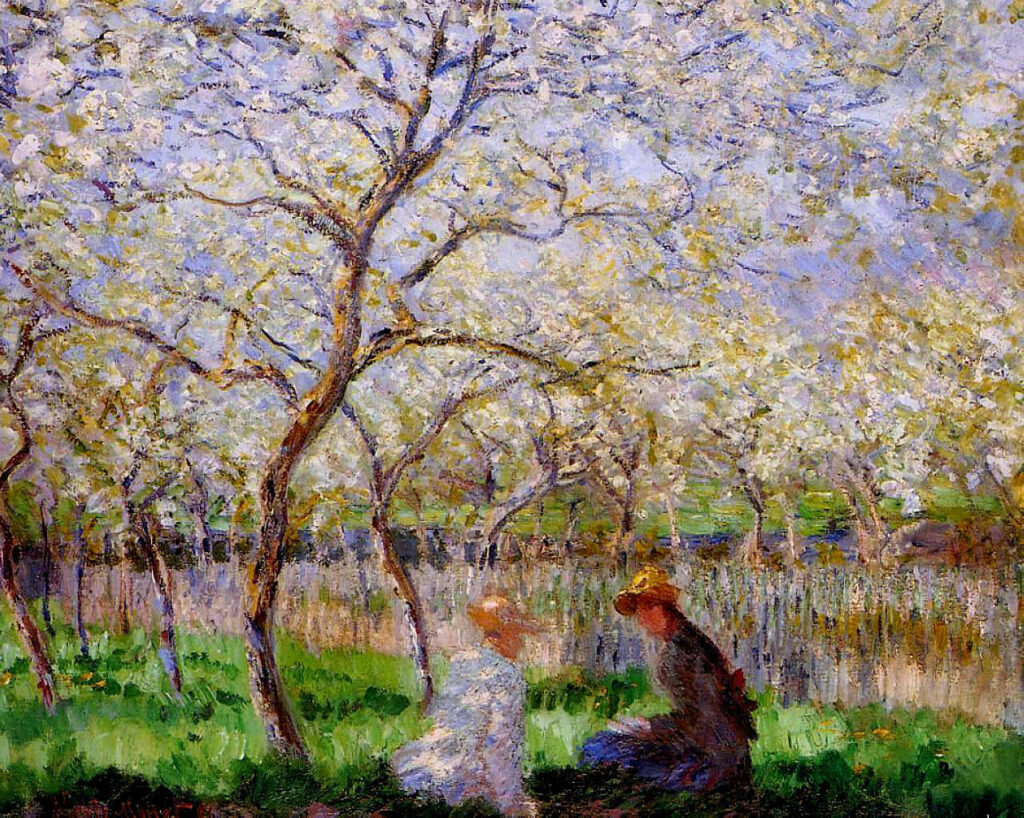
Springtime by Claude Monet, 1886 26″ x 32″ Oil on Canvas Fitzwilliam Museum (University of Cambridge), Cambridge, UK
My copy of his painting is pictured below.
I first tried this with acrylic paint in 2016 and just did this same painting again with oil paint this week. I even found a fun frame for it from a local thrift store to set it off. It’s going in my laundry room which I just had painted pale pink!
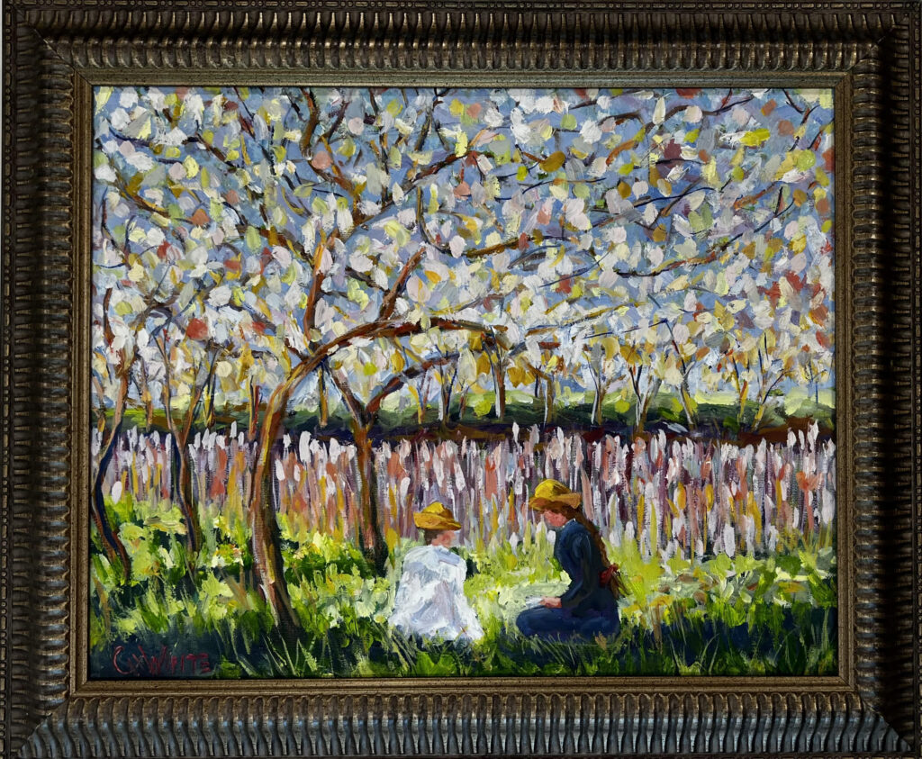
Study of Monet’s Springtime by Cheryl Harris White 16″x20″, oil on canvas, framed.
I used my own style for the brushstrokes and painted as loosely and freely as possible. I love the two women reading together in light. They are surrounded by color and life which is something I love to celebrate. It’s not exact…It’s not identical…but it is beautiful to me. That’s why I love it.
What I learned from completing this study.
I can get a reasonable likeness of a painting and feel the pressure or constraint of having to make it perfectly identical to the original.
Freedom comes from painting similar to the painting I’m copying, but not exactly like it. This type of painting loosens the flow of creativity I have within me and it is enjoyable.
Ultramarine Blue and Yellow Ochre are my hero colors. They add such richness and depth.
I like painting hats.