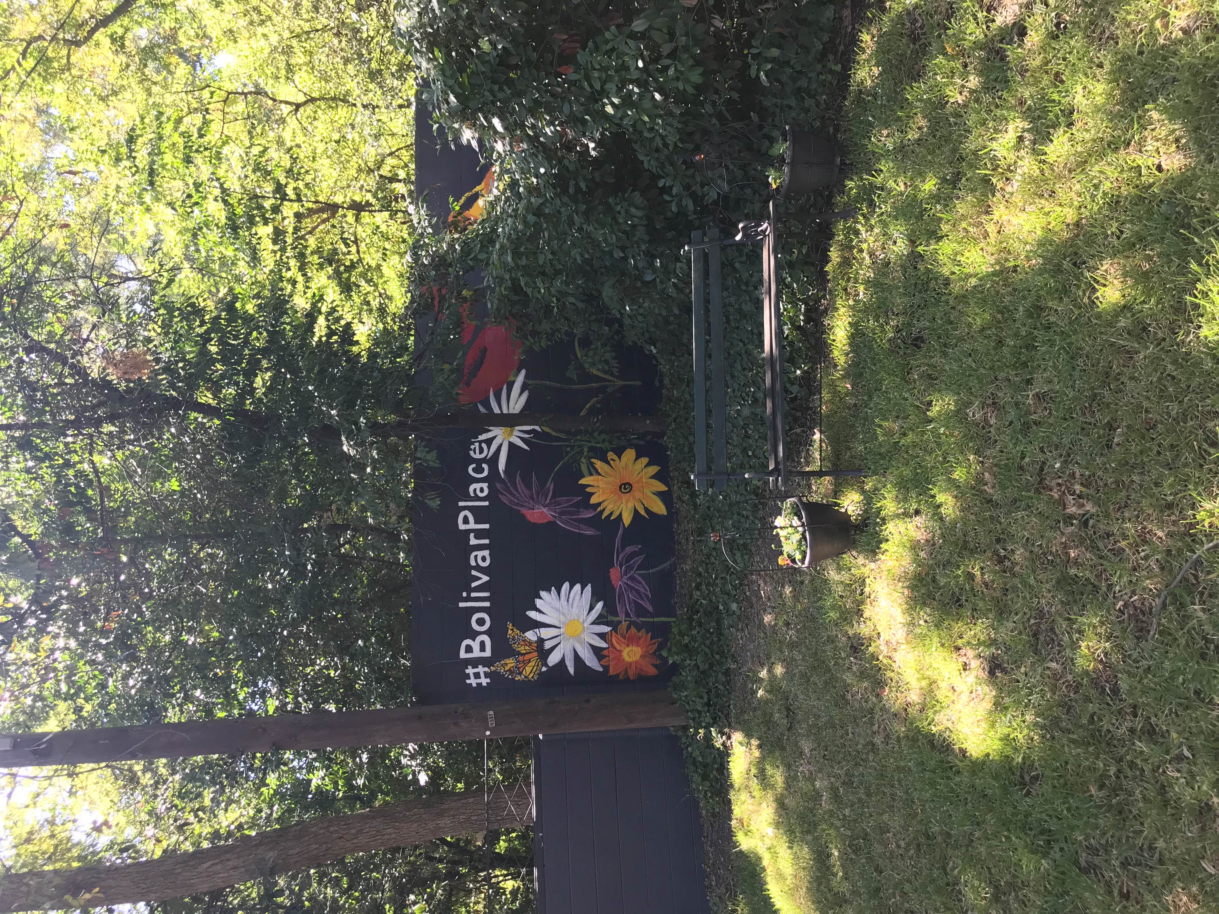
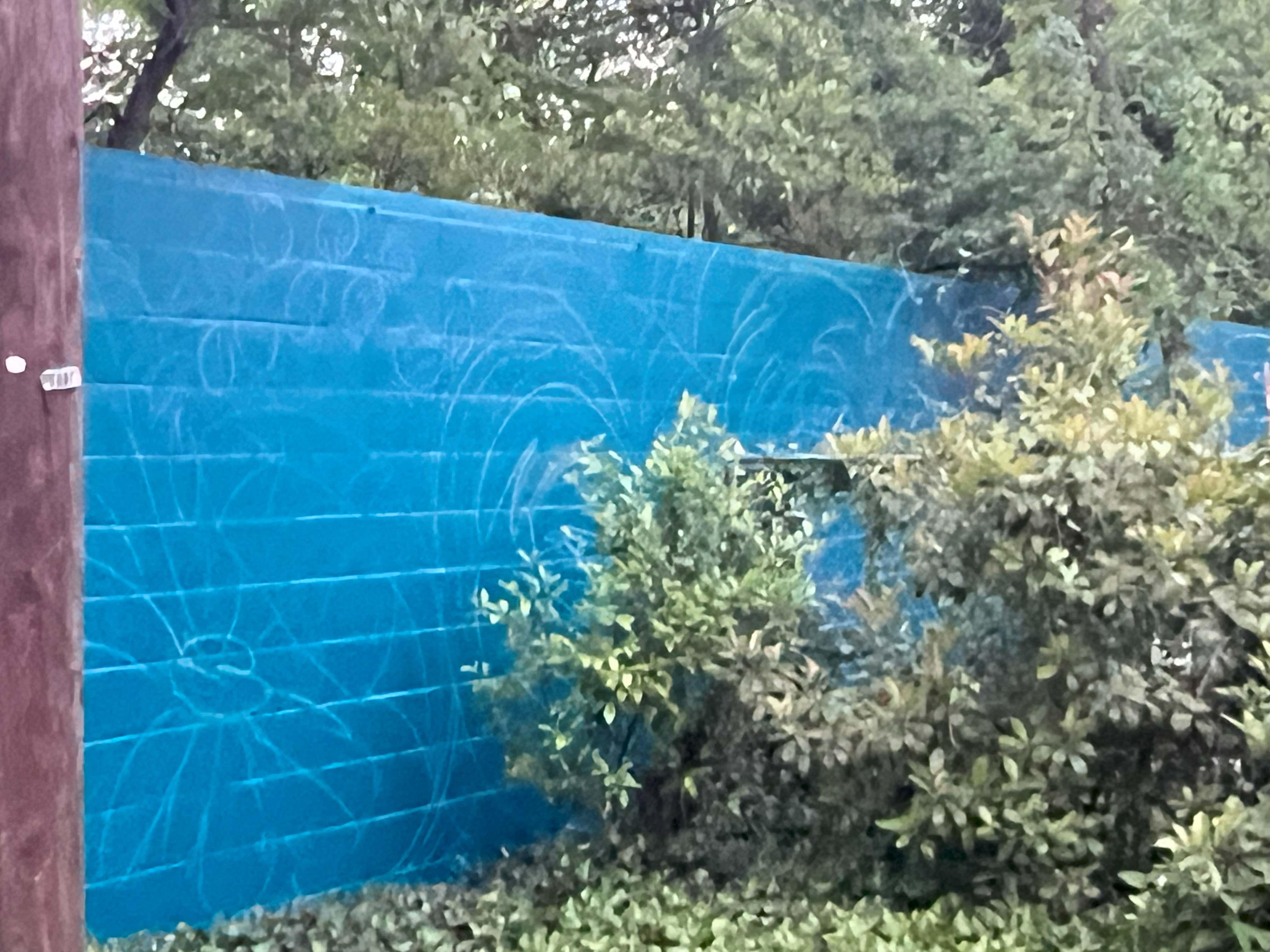
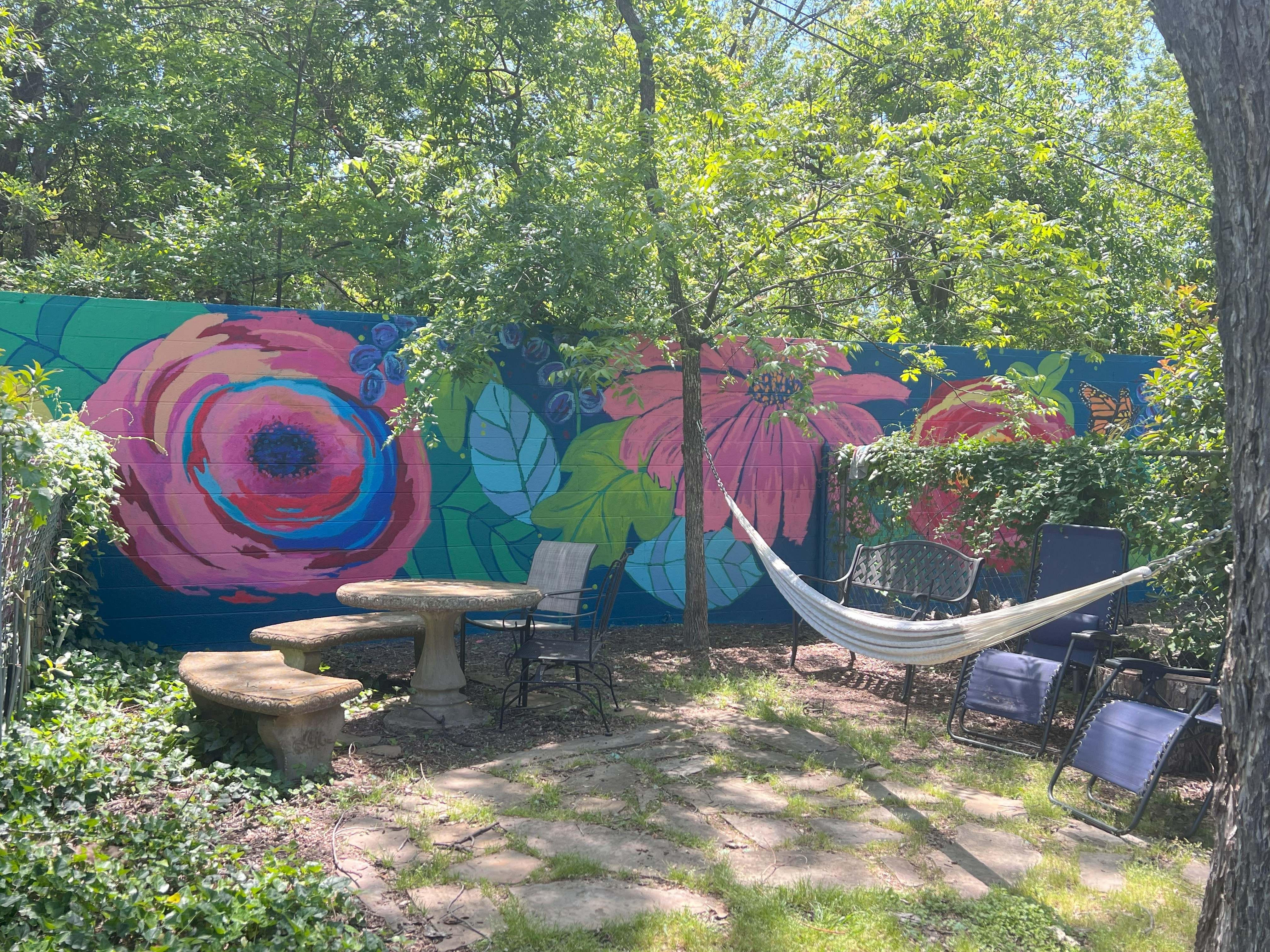
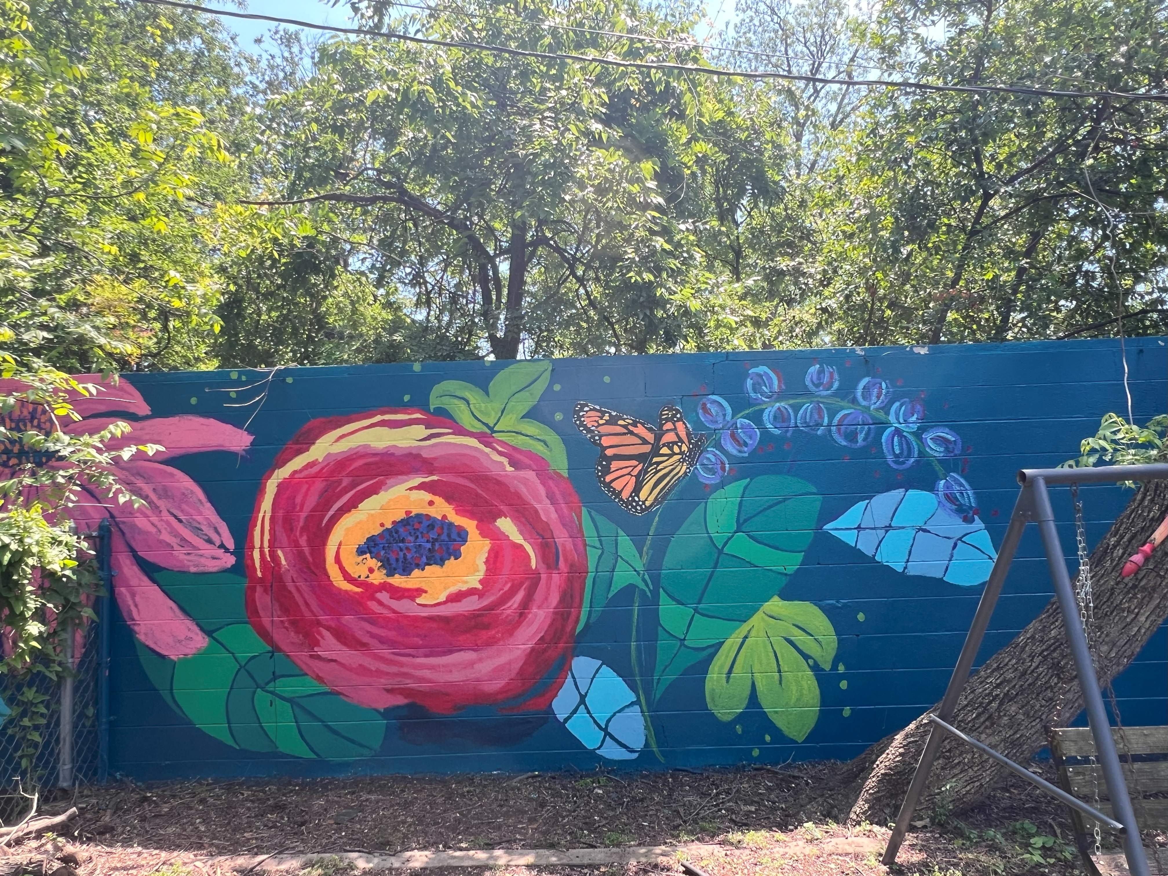
This eight-foot-high wall separates our Airbnb property from our next-door neighbor, and the mural on it was about four years old. Here are some photos of the original mural from 2017.
#BolivarPlacePoppies, Coneflowers and Daisies on a Dark Blue backgroundAfter four years the paint faded and began chipping off.
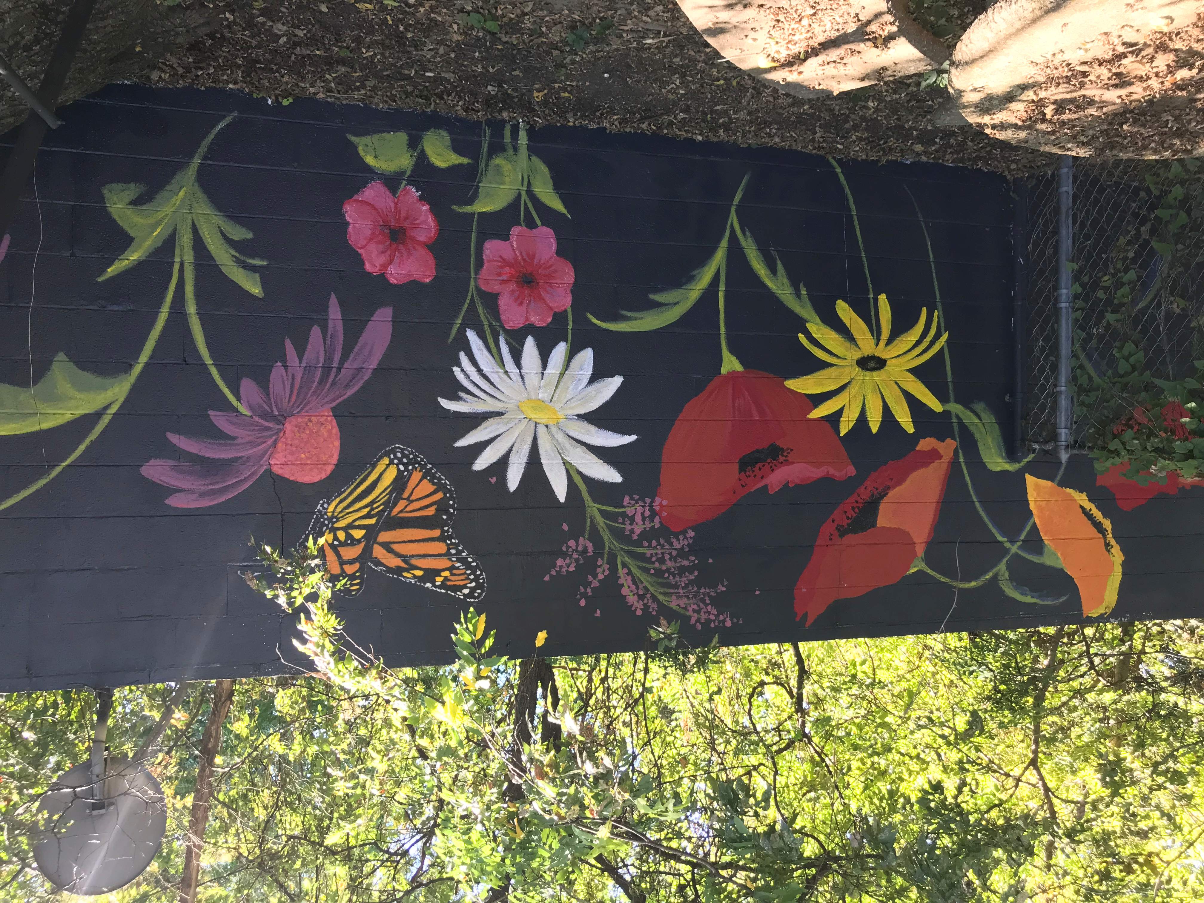
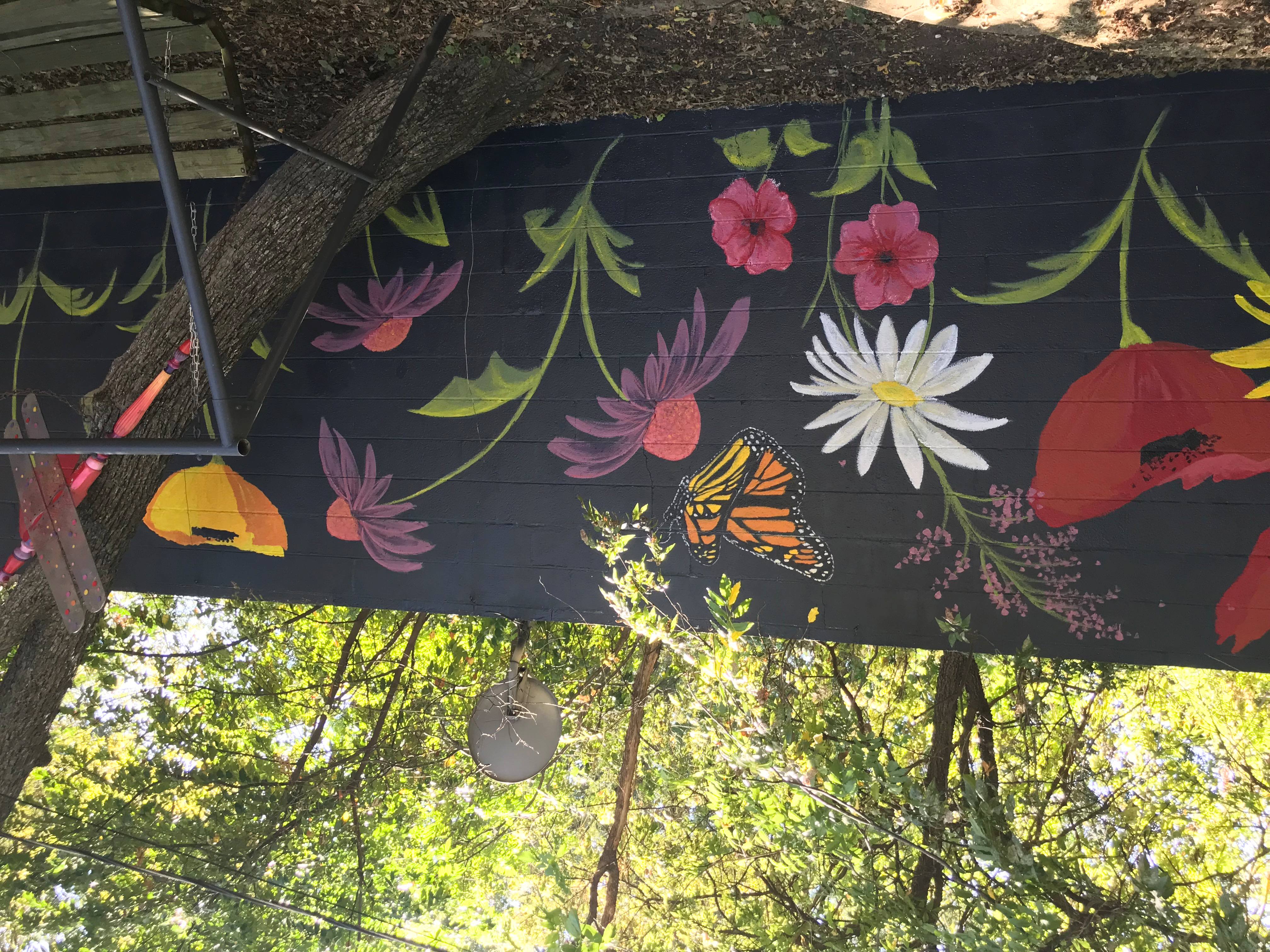
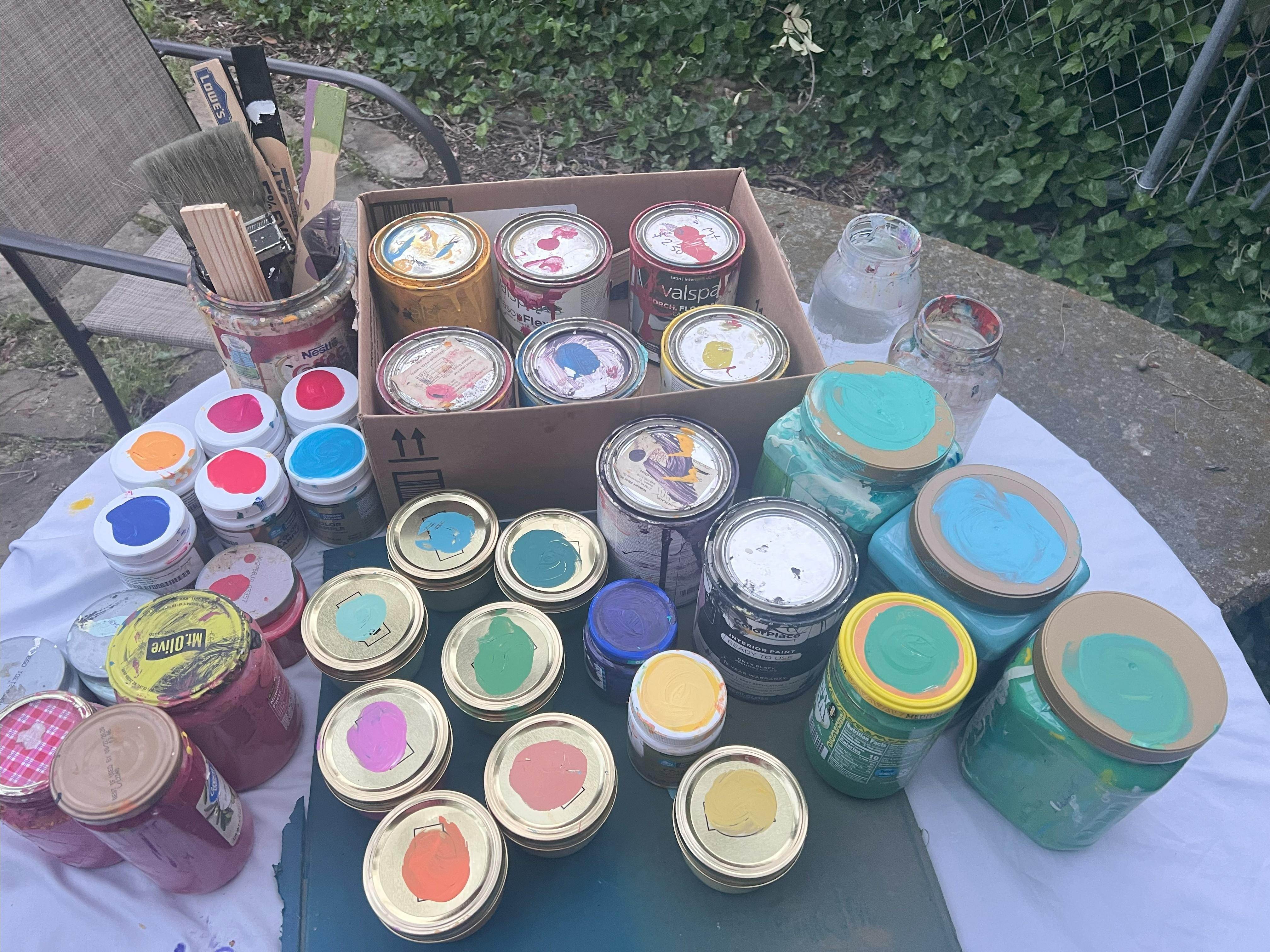
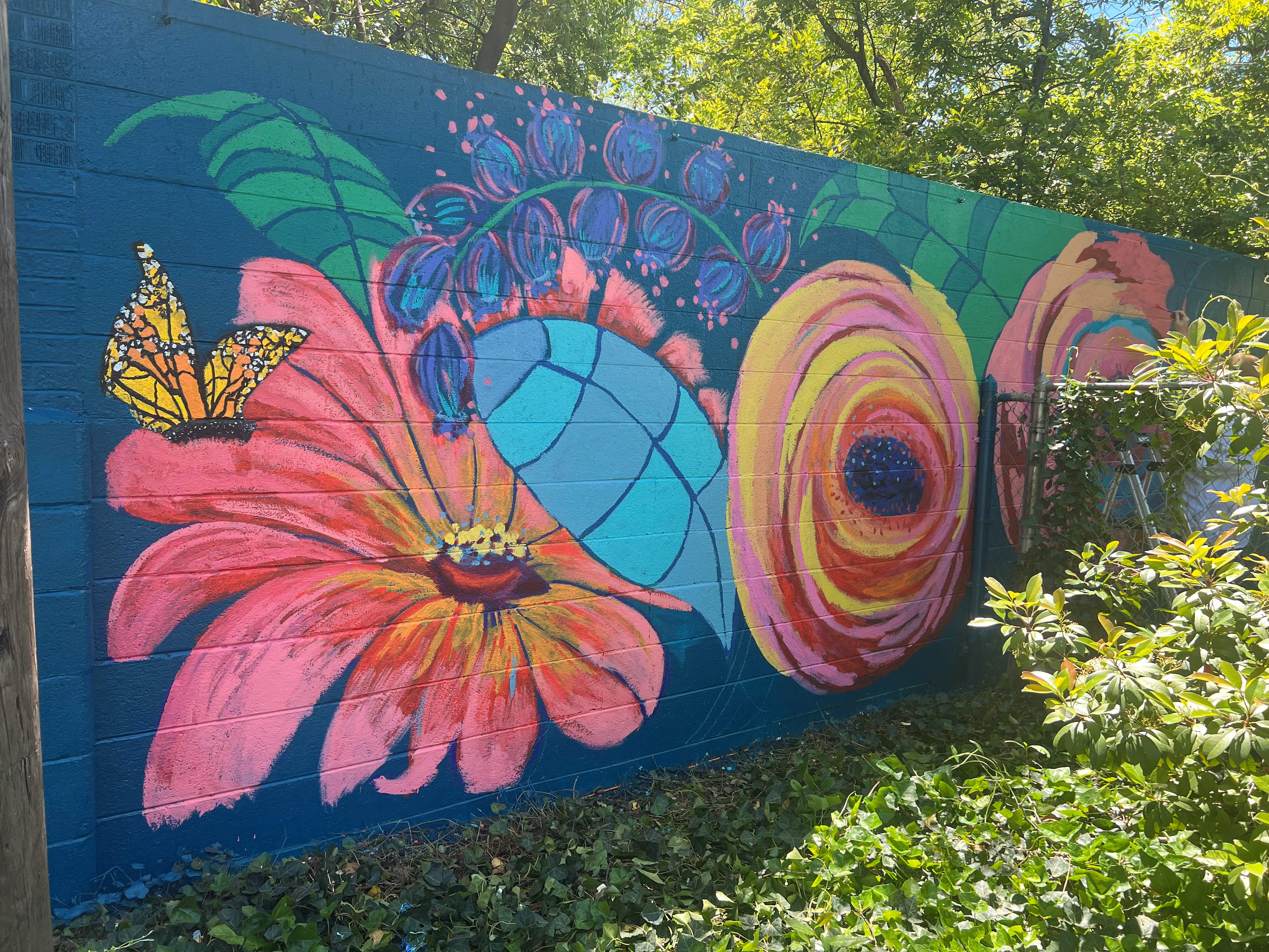
Last weekend, spring and a three-day weekend beckoned me outside to revive it. Some of my favorite flowers are zinnias, coneflowers, and peonies, so I made them the stars of this show. The background of the wall was “Deep Water” from Valspar at Lowe’s, which is a beautiful dark aqua color. I also used several blues, reds, yellows, a pink, and white to mix my own colors and saved them in smaller jars. All the paint was exterior satin, and we did prime the wall first.
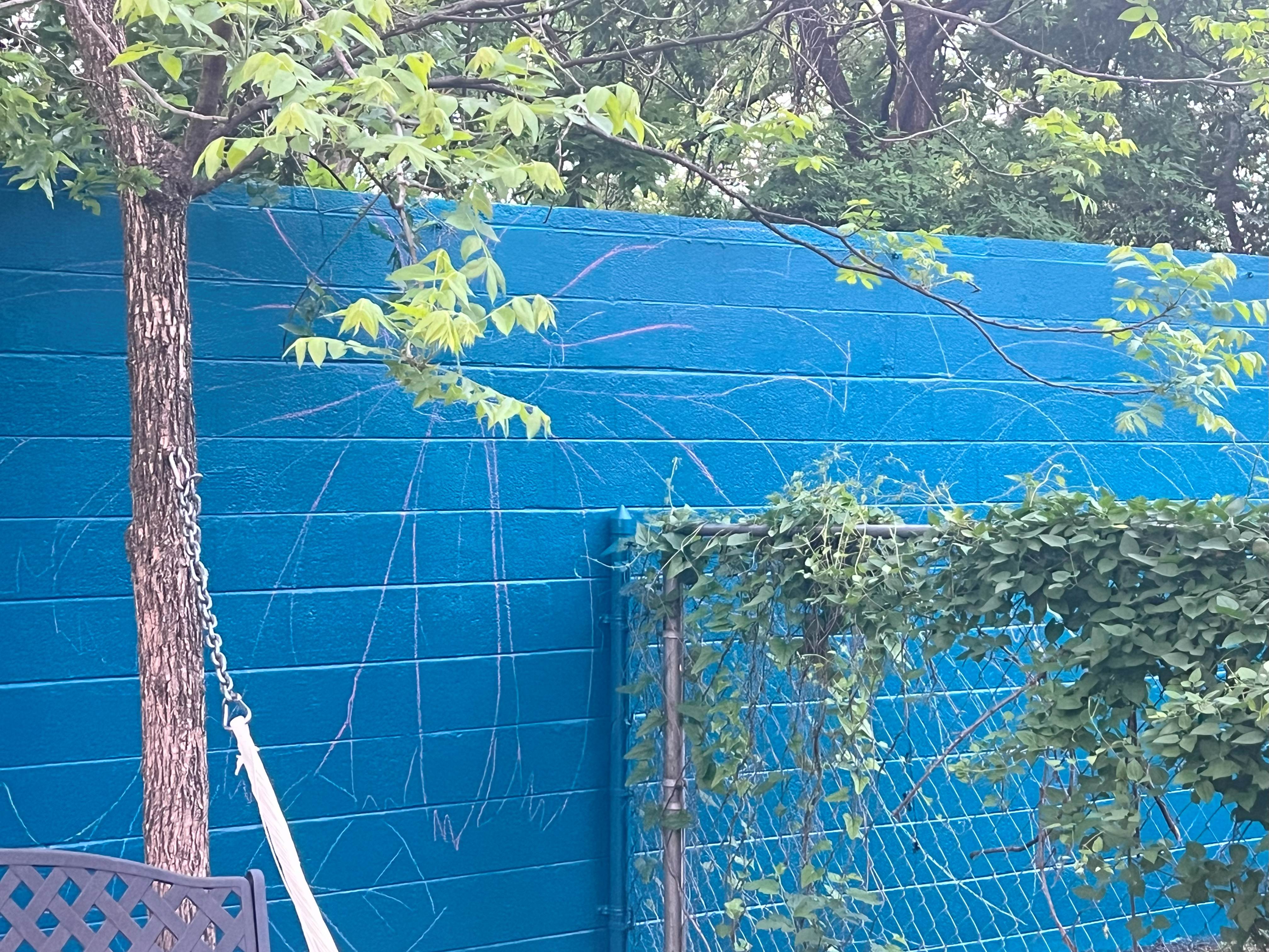
After the background color dried, I chalked out the large floral design and got started. This step was quick and easy as I could just erase chalk if needed with a wet paper towel and keep sketching.
The mural is actually in three sections because of a fenced patio we have, but the total width was about 20 feet, and it took me two days to complete the actual painting part. I love that this is my view from my art studio and that our upstairs guests can enjoy it as well. Happy Spring!
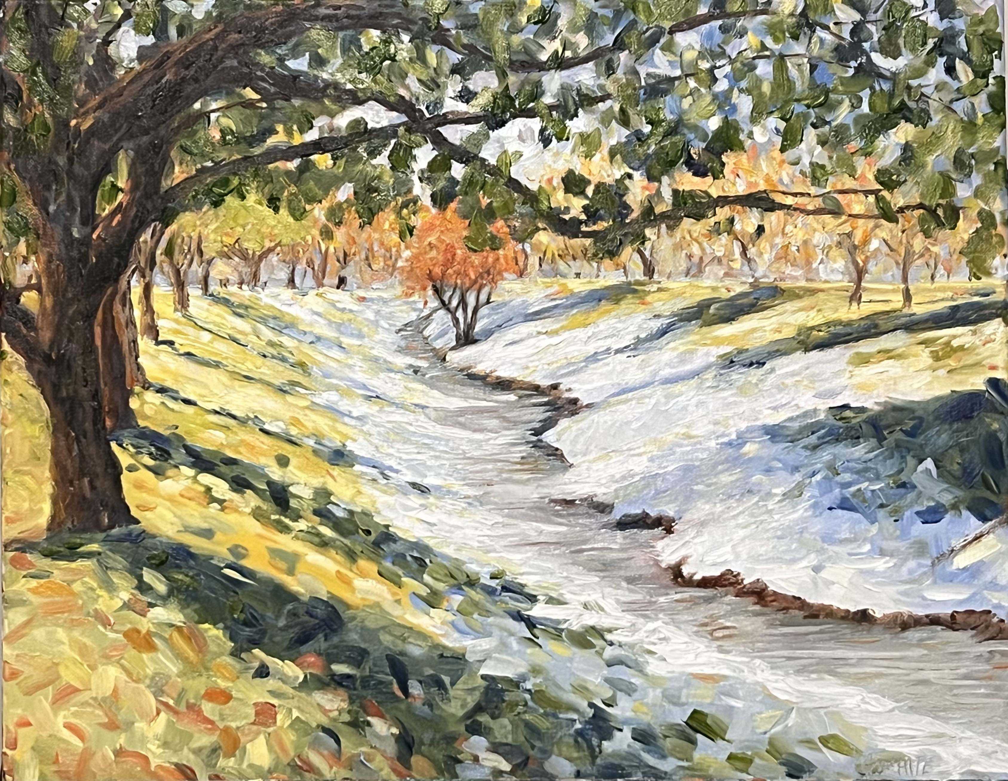
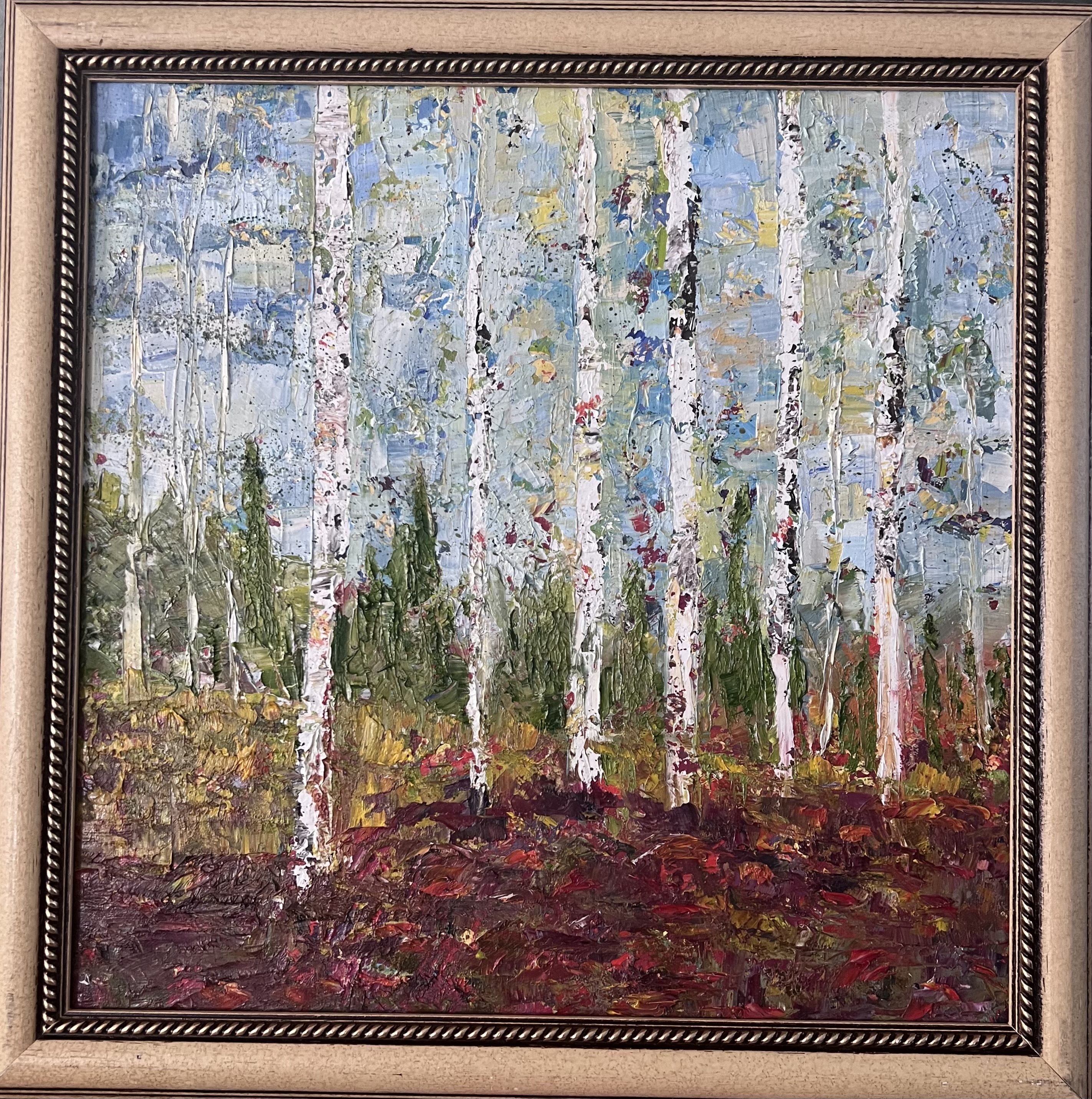
As a child in Ohio, I remember hours of play in the snow. All the neighborhood kids would come sledding together, or ice skate on Briar Lake. Snowball arsenals forts and snowmen were a regular part of my winter journey as a child. In Texas, snow is a rare occurrence. If it does happen to snow, it usually does not last for days, but in January, we had what I would call delightful snow here. I loved its crunch as I walked in it and how it stuck together. I took the reference photo for this painting during a winter bike ride through the park near my home and loved the idea of capturing the vivid colors of the grass and trees with the cool blues of the snow and water.
Melting Snow QuakerTown Park, Denton,
20″ x 16″ oil on canvas, framed
January 2025
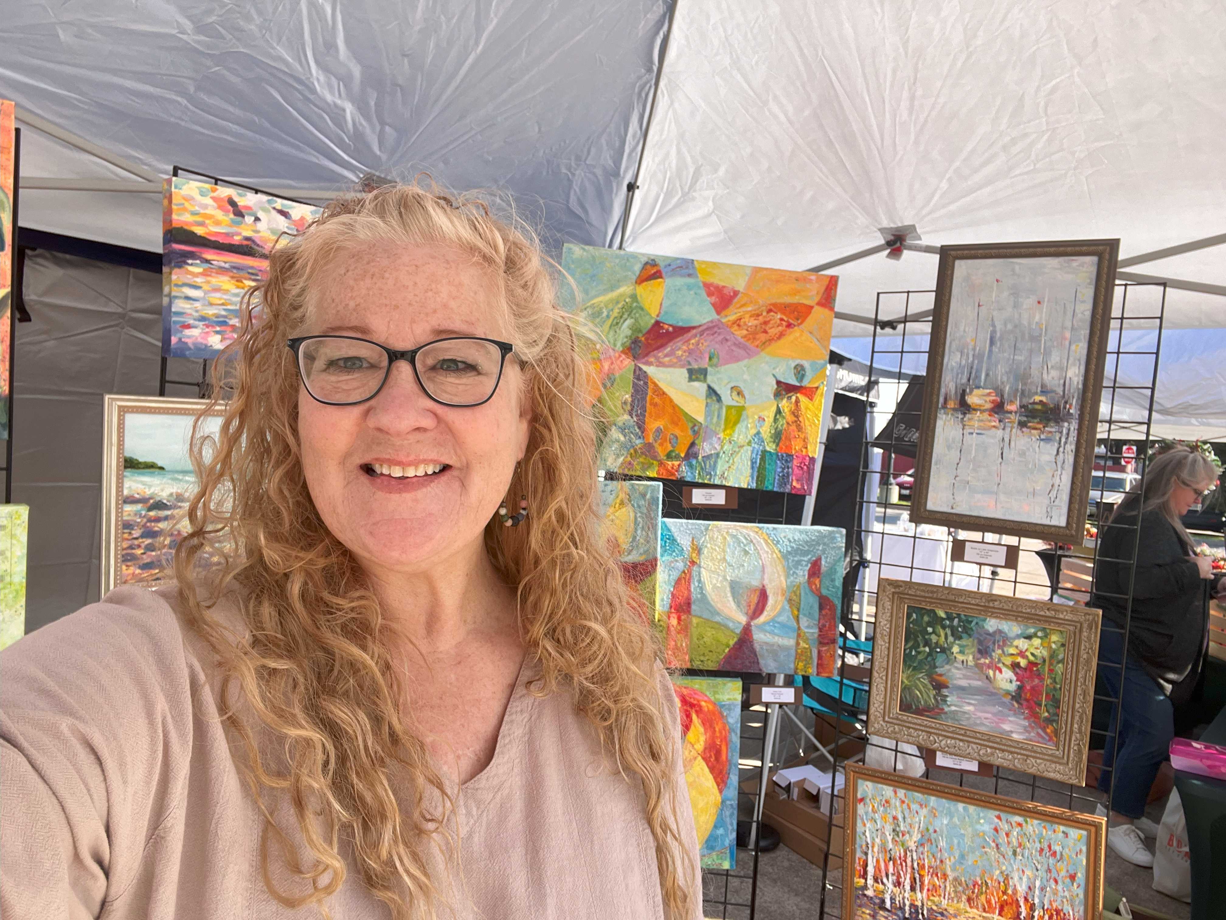
Looking for some artful personal gifts this year? You are in the right place. One of the things I value most about the art I create is not only that it celebrates color, life, and light. I also have a passion to create art people would want to hang in their homes and spend time with each day. One of the most rewarding experiences as an artist so far, was helping my mother-in-law move last weekend. She was moving to a much smaller place and was getting rid of a lot of possessions she’d had for many years. I was so honored that she was keeping the art I had given her while many other things were being donated or thrown away. It meant something to me that she felt a connection with my pieces that she didn’t have with so many other things. This encouraged me to continue making art that can be enjoyed and experienced inside homes where people do life every day. When I sit down to paint in my studio, that is what I think about. Will this piece mean something to me or to someone else and possibly become a treasure in their life and their home for years to come?
Confetti Birch, Oil, Palette Knife, framed canvas, 18×18 $205.00 framedPink Blooms in Gold Frame, Oil on Canvas, 14″x14″ and 17″x17″ framed, $150.00
Time will tell, but there are two places besides my new online shop where you can purchase my art in person. Come see me!
Denton Thanksgiving Market, Saturday 11/16/2025 at 101 S. Locust St. in Denton, Texas (next to the Wells Fargo building off the square) from 9 AM to 1 PM!
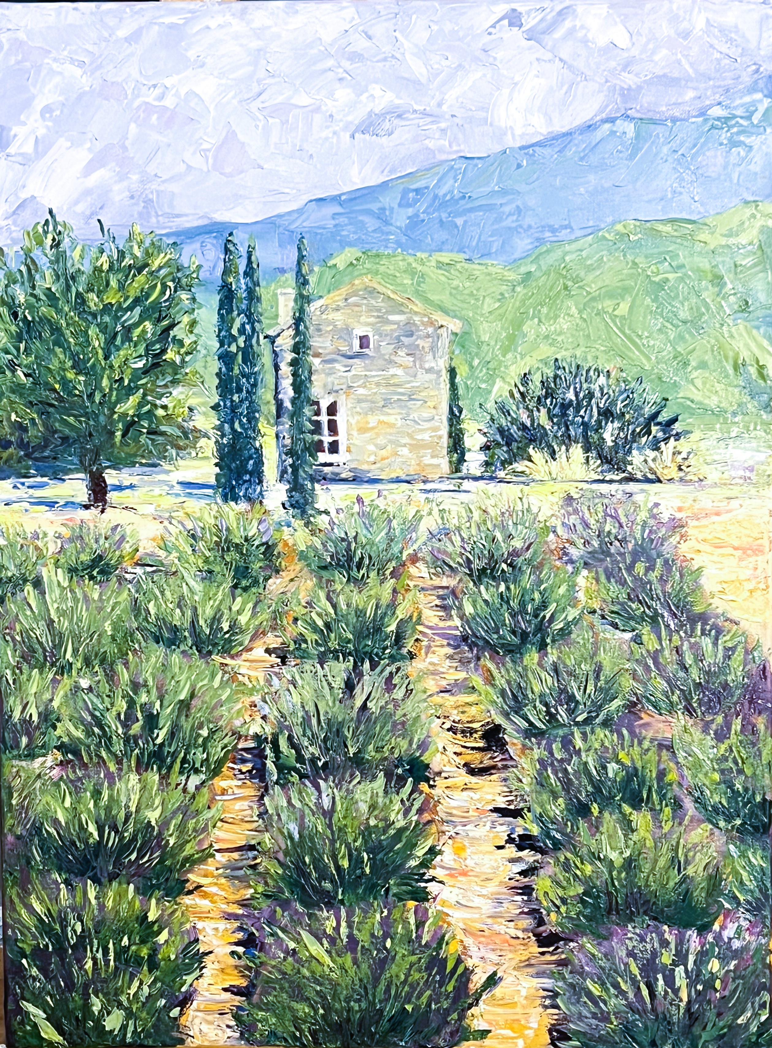
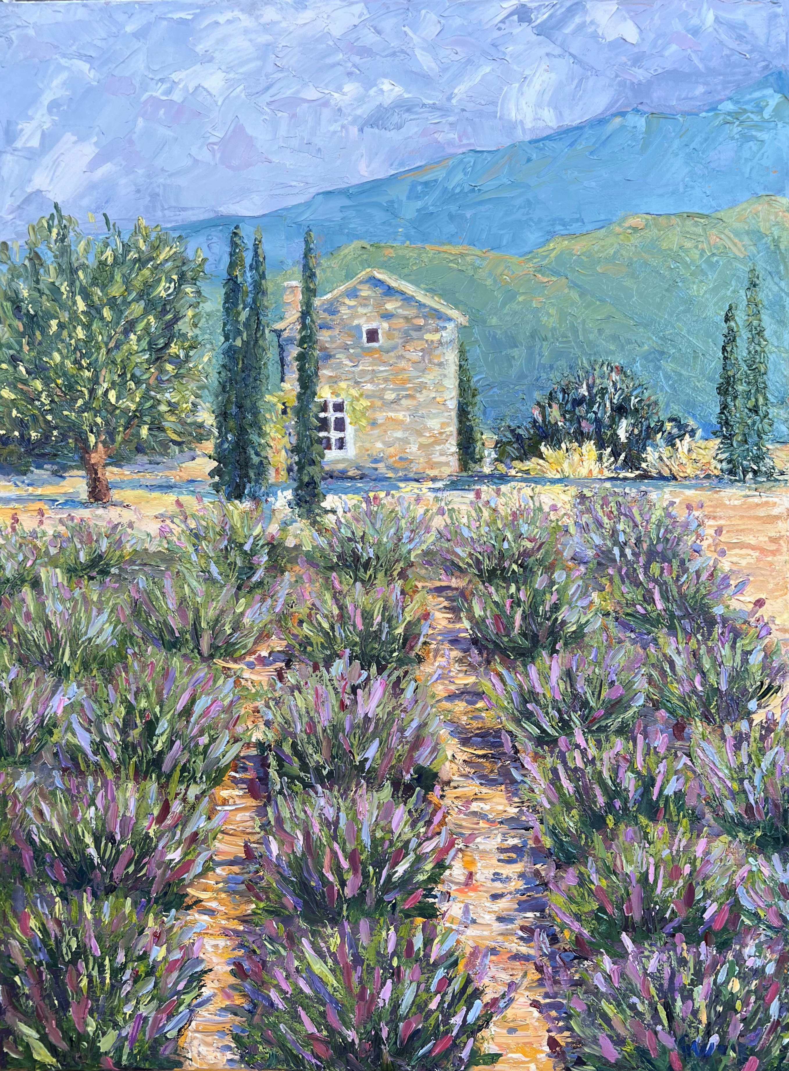
Have you ever been stuck as an artist? It’s a helpless feeling when you know something is wrong with a painting, but you don’t know what direction to go next. This is what I experienced about half way through my recent “Singing Lavender” piece.
There are a lot of problems with this painting. First I had not finished adding the lavender blooms yet, but I couldn’t even get there because of the pale green mountain and house that seemed so flat.
I study palette knife oil painting at “A Touch of Paris Studio” in Grapevine, Texas. When I got stuck on the painting, I reached out to my instructor, Dominique Galleron for direction and she asked if she could invite the rest of our class to participate in an art critique.
What is an Art Critique?
An art critique in this context is basically a conversation aimed at analyzing, describing, and interpreting the work so far. It provides valuable information and direction and leaves room for the artist to ask for clarification and make their own decisions on the application. It sounds vulnerable, right? But, everyone’s hope and goal is to contribute to each other’s success, so I knew I was in safe hands. Also, painting anything is vulnerable. It’s a part of yourself stuck to canvas for everyone to see. However vulnerable it sounds, I knew it would help and jumped at the chance for feedback. It was amazing to recieve the feedback from other artists and it was just what I needed to move forward from this place of being stuck.
If you are an artist, you need to find your people. People who will help you grow and encourage you in your art journey. One way to do that is to search online to find art groups in your city or enroll in a group class at a studio. If you like the way an artist paints, find out if they have tutorials or classes. These are some great ways to connect with other artists and learn and grow together. If that is not possible, I’ve also found a wonderful free art group online at www.artkula.com. There are options for you to only join the spaces for the type of art you are interested in and the artists there are extremely supportive and positive.
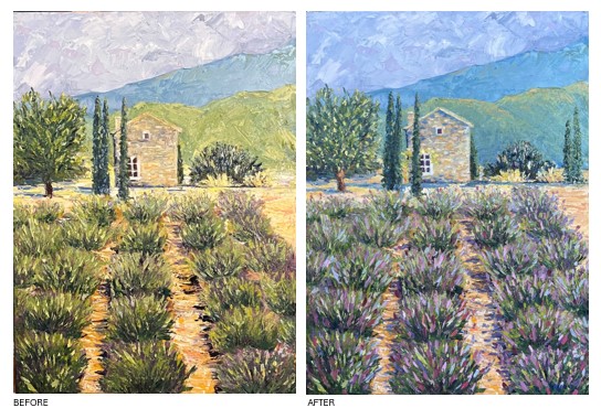
Singing Lavender, Before and After
Here’s the difference after the critique session
The main problem I had with the piece beforehand, was the large pale green mountains between the farther range and the house. Adding some tone nearer to the far mountain range helped. Then adding some highlights already on my palette and tied it together with the foreground. Once I had this done, adding the blooms on the lavender plants just flowed. I softened the hard purple shadows on the left to blue, soft shadows on the right, and added a few more cypress trees and a grape arbor to balance out the mid-ground. I added more blue shadow under the house and more of the warm ground color as well to help it stand out. I added white highlights on the roof and chimney as well and highlights on the left tree.
Singing Lavender, Oil on Canvas,18×24″ framed, $500.00
What I Learned
I learned so much about the value of having input from others through this process. I think this is also true in life, not just in creating art. It was such a picture to me of how we are created to love one another. One way we do this is what I call “gentle truth telling”. The word critique does not necessarily mean something negative. It’s important to let go of fear in order to grow and to find safe people who care enough about your growth as an artist and a person to speak what is true. Many of the artists shared what they liked about the painting, but even the constructive comments were all toward or in the direction of good. What a difference!
I didn’t apply everyone’s suggestions, but some of them were priceless. I am so thankful for this group of artists that I paint with and for Dominique’s excellent instruction. This was such a helpful process for me and I’m grateful to have had it and to have a finished painting as the result.
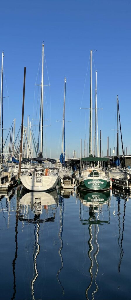
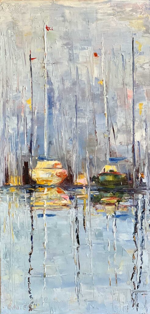
When I saw this photo I had to celebrate the sun sparkling on the water and these boats with a painting! What attracted me to the image at first was the difference between the straight masts and their wiggly reflections. I knew I wanted those reflections of the masts to dance on the water. The row of boats tied to the dock were begging for the oil with a palette knife style I have learned from my art teacher and mentor, Dominique Galleron. If you are ever in Grapevine, check out her “A Touch of Paris” gallery and studio. I loved painting this at Dominique’s studio so much today. She’s an amazing artist and person.
I was searching for free reference photos of boats on Lake Grapevine online when I found one of some boats docked at Silver Lake Marina.
I grew up boating on Lake Grapevine with my Mom, Dad, and sister. I’ve always loved the water and learned to swim from a very young age thanks to swim lessons at the YMCA, Briar Lake, and Camp Rocky Point on Lake Texoma. My Mom and Dad are gone now and we don’t have that boat anymore, but every time I drive by Lake Grapevine, the memories bubble to the surface and I soak them in.
I remember looking straight up in the blue sky, the sun shining on my tanned skin and just floating in the cold water of the lake. Summer days spent out on the lake were actually one of the few times when our whole family was happy and I felt free. It was like the water melted the stress and frustrations burdening our family at the time and what was left was just joy. I soaked in those happy memories today as I painted this.
Soaking is actually something I do a lot when painting. It’s just a way of thinking about life giving things and being thankful for them. I think about the feelings the subject brings out and what I am celebrating as I paint it. Painting is always a celebration as far as I’m concerned and this was no exception. What do you soak in? Is it positive? Is it Life-giving? Is it something you can savor that bathes your heart in thankfulness? If you have those things, you are blessed. You too have something to celebrate and treasure in your heart. These soaking times are an opportunity for me to acknowledge God and recognize that He is indeed good and delights in giving gifts to His children. James 1:17 reminds me to be thankful for everything from the memories to the painting supplies and the hands He gave me to make beautiful things with. This is called gratitude and this is the place in my heart where my paintings come from. Enjoy a little soaking today as you look at this.
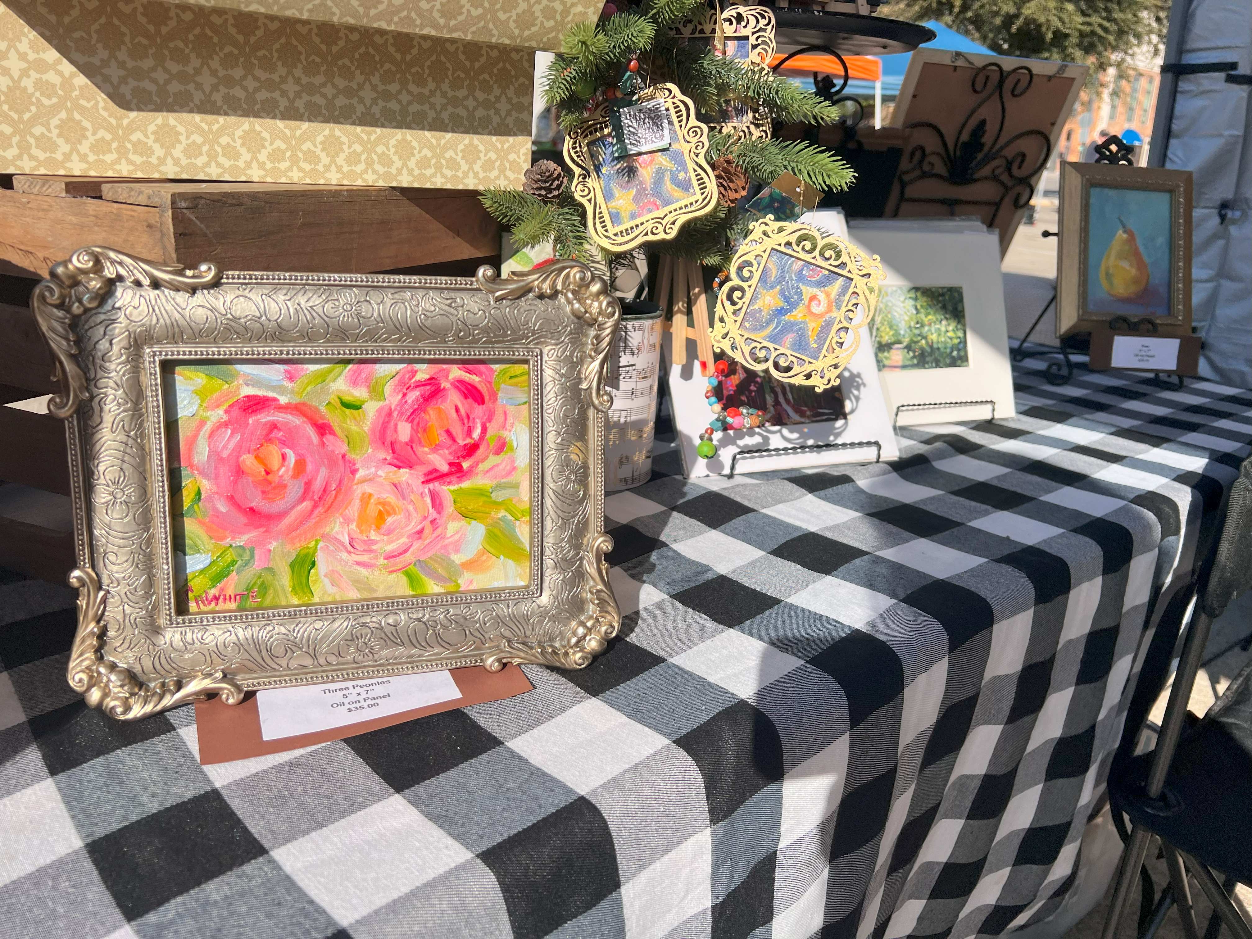
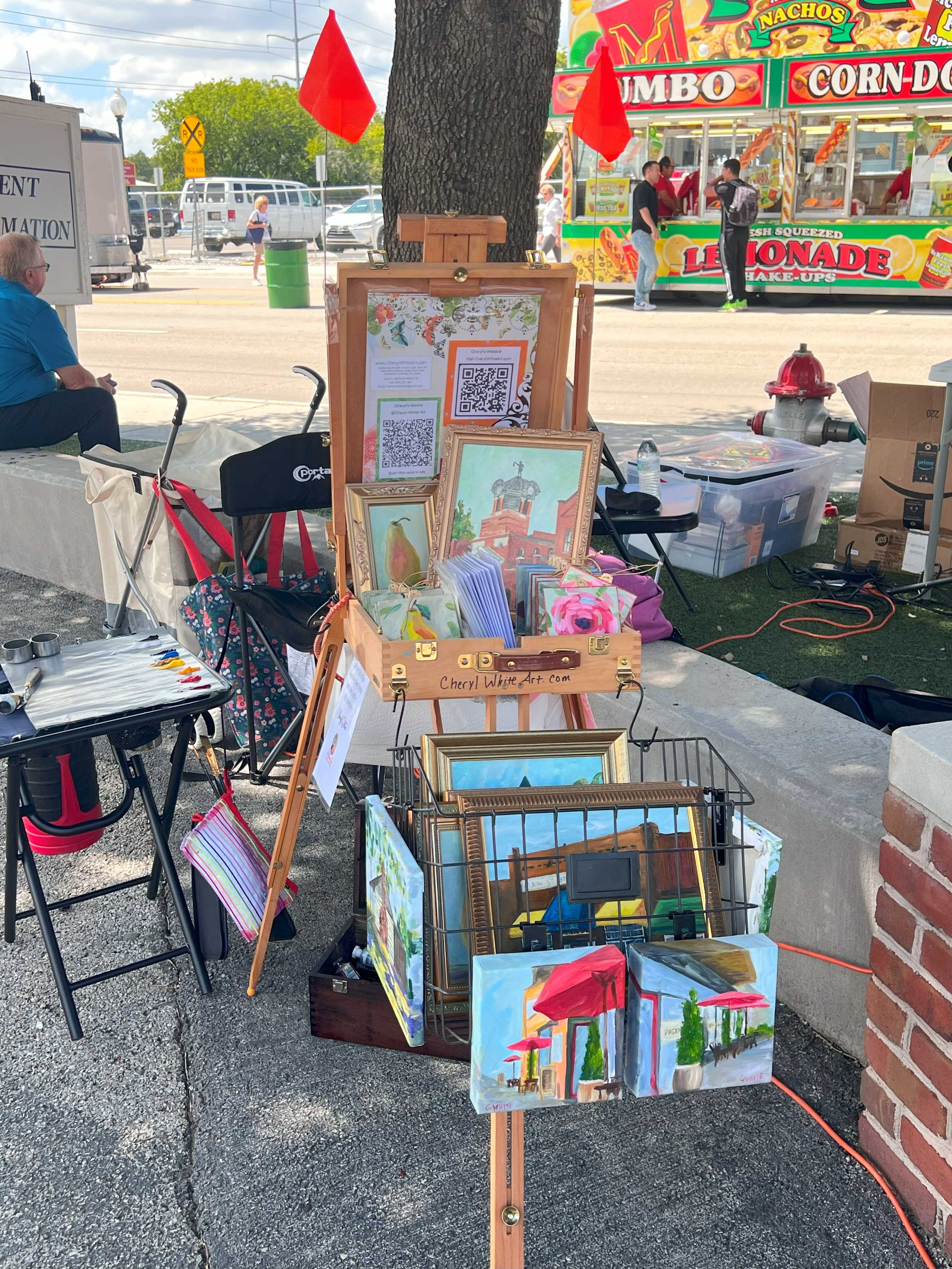
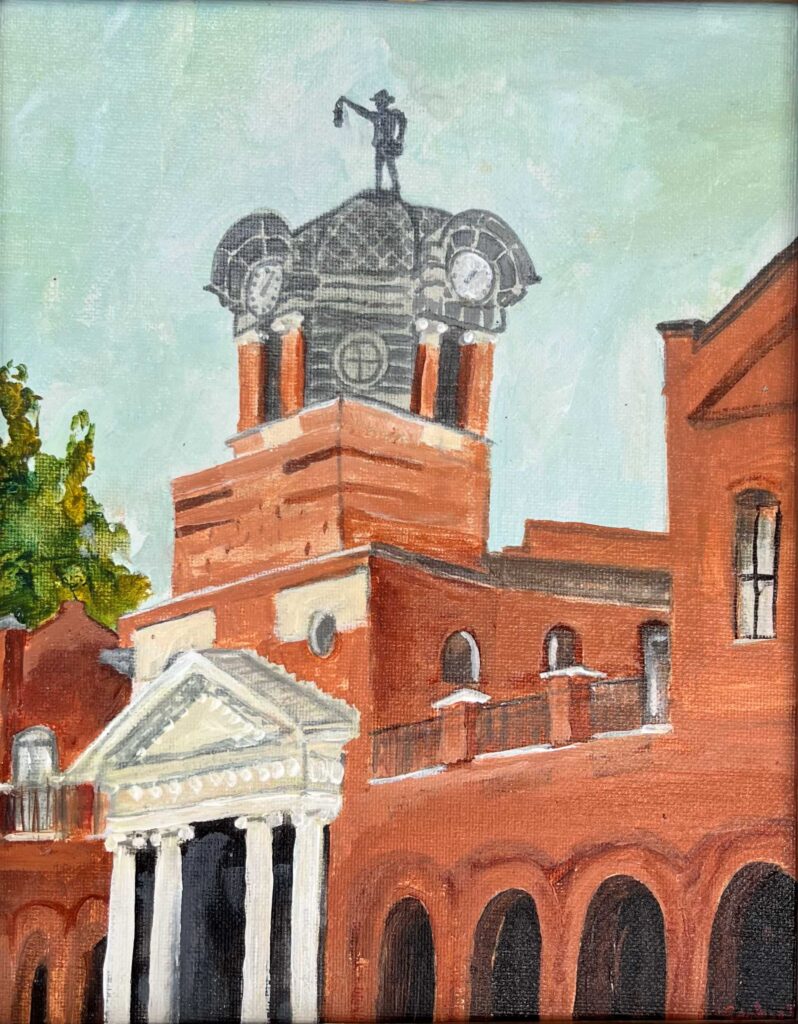
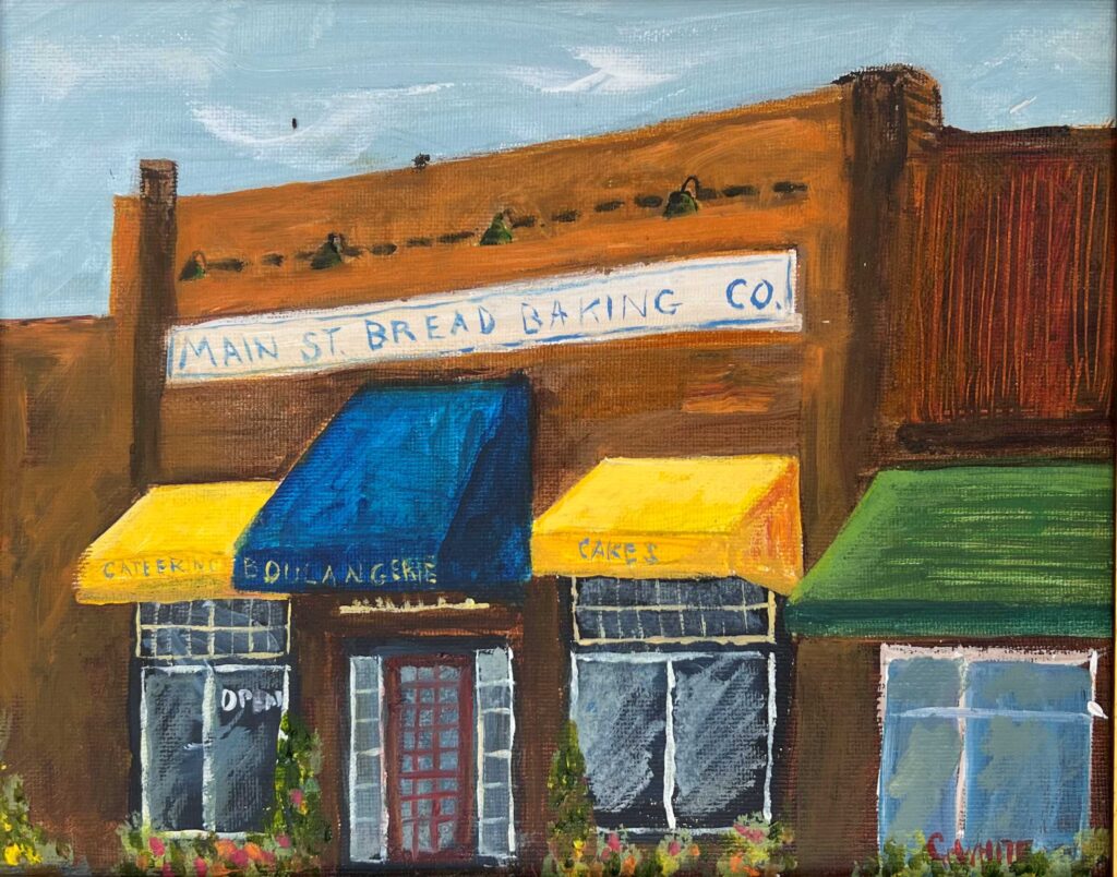
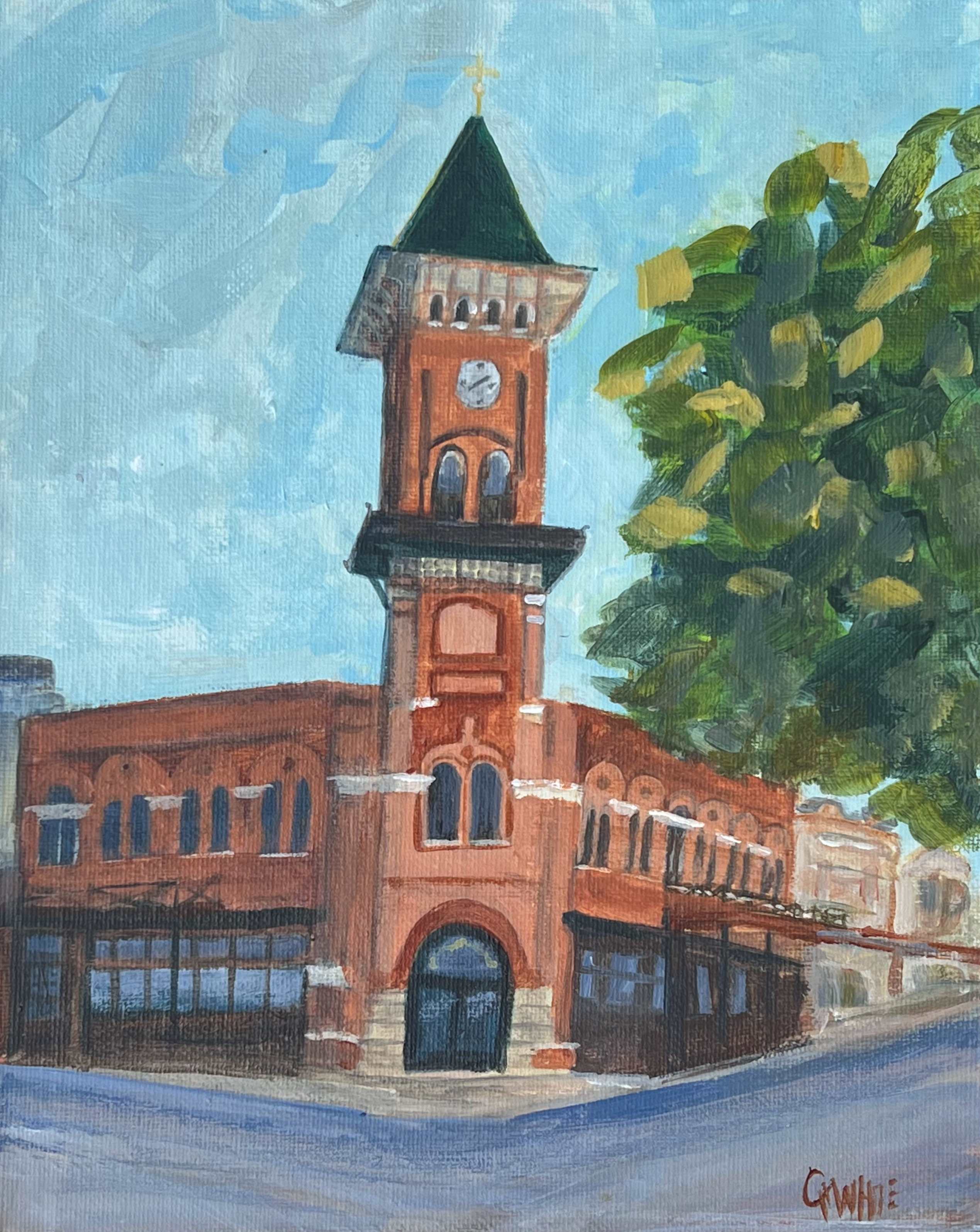
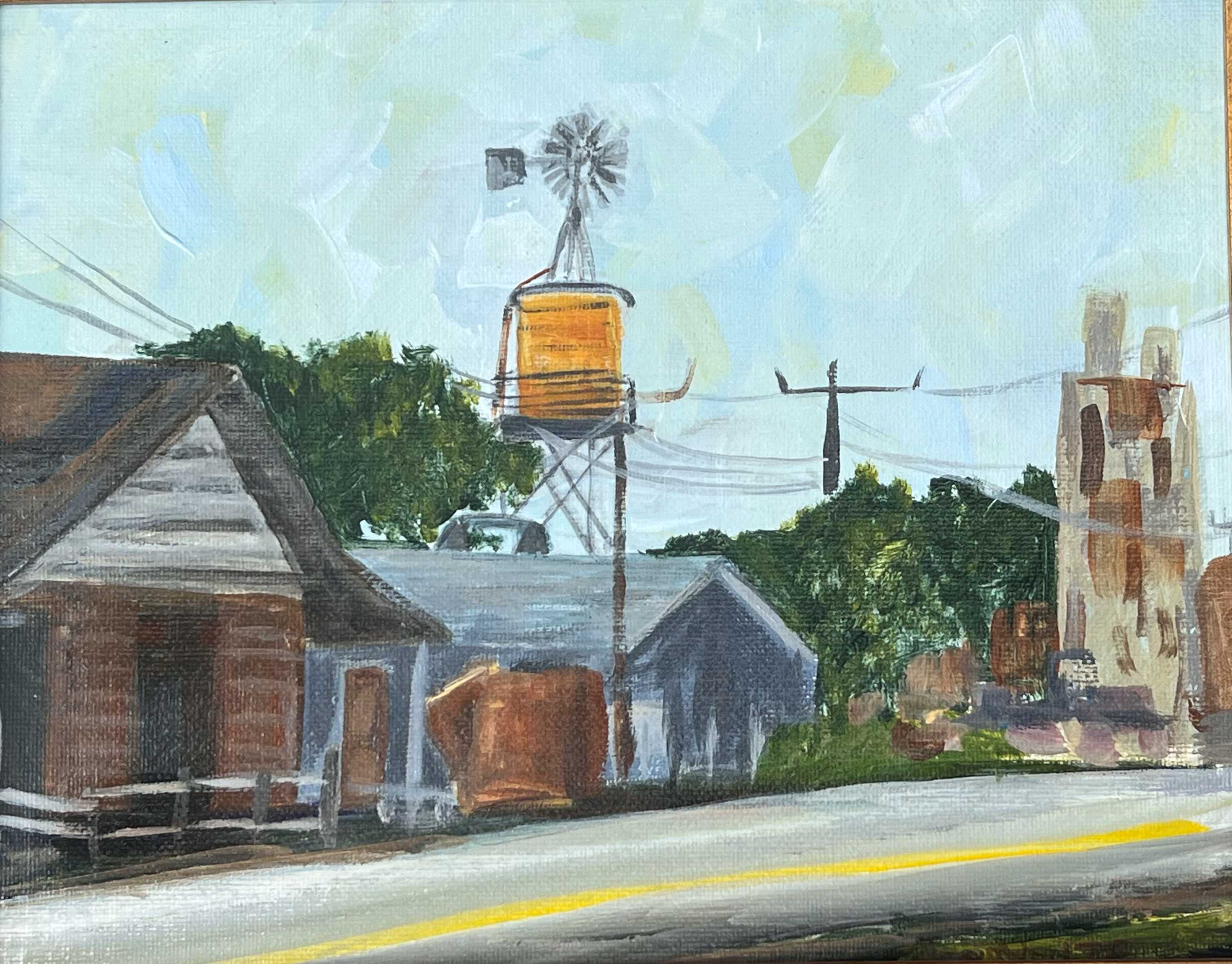
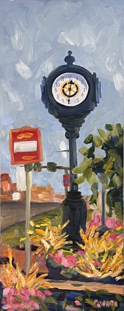
Grapevine City Hall, Acrylic on Canvas Board, Framed, 8X10″, $45.00Main Street Bread Company, Acrylic on Canvas Board, Framed, 8X10″, $45.00Grapevine Visitor Center, Acrylic on Canvas Board, Framed, 8X10″, $45.00Grapevine Windmill and Buildings, Acrylic on Canvas Board, Framed, 8X10″, $45.00Clock on Main, 8×20 inches, Oil on board, $125.00, framed
While it was nice to use my new plein air easel and test out my system, the best part of the experience was interacting with the humans. So many different humans, conversations with humans, and interesting interactions. Some people just wanted to watch me paint, one woman sat on the grass and just silently watched and smiled without saying a word. The most curious were the children and the adults who had already been to a few too many wine tastings. Each conversation was another connection with someone I had never met before and most likely would never meet again, but they each mattered. I think there is something holy and beautiful about taking the time to connect with strangers. Each one was a rare opportunity to share some joy, learn something new, or even sell a painting or two.
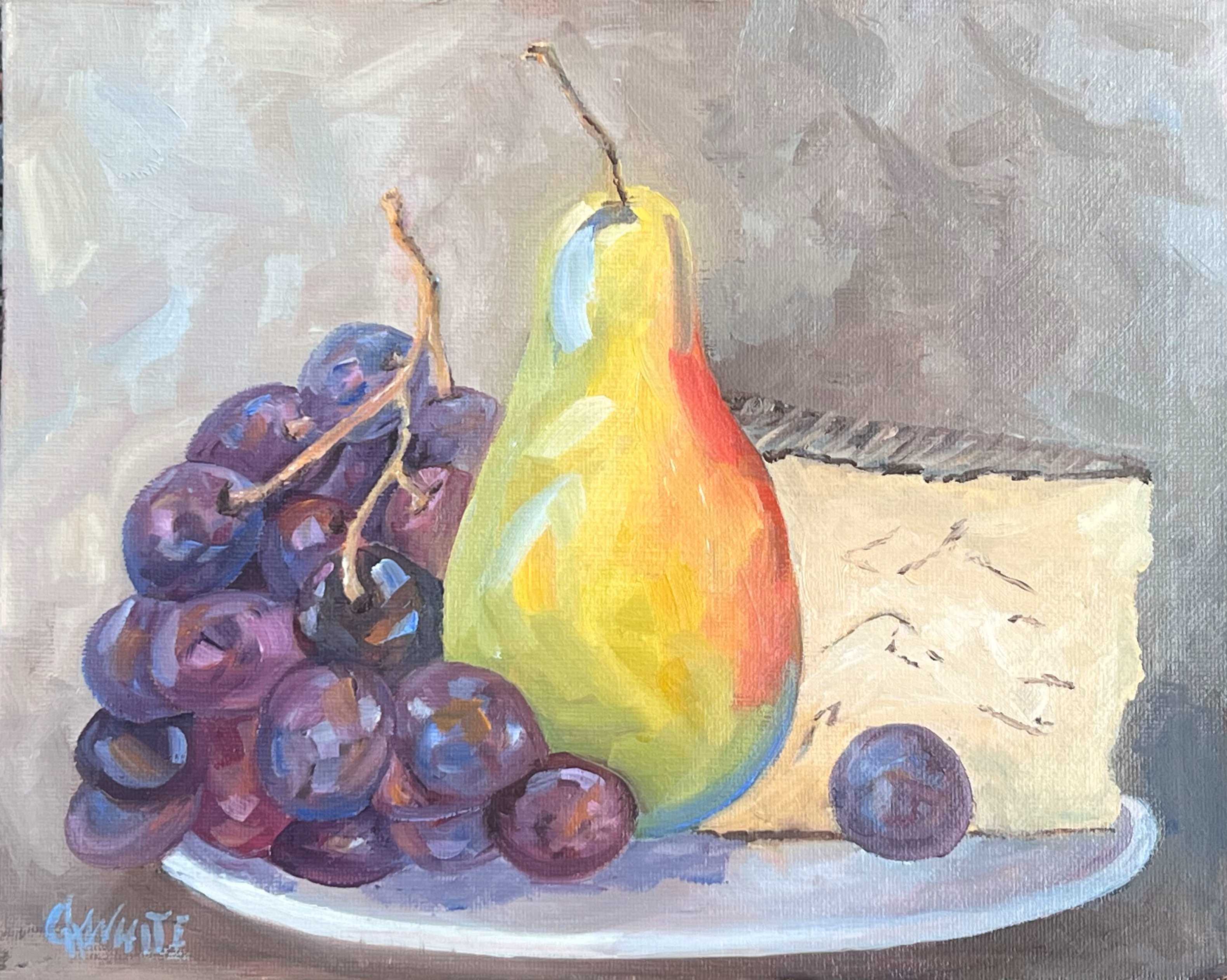
Grapefest Wine and Grapes 2024, Oil on Canvas Board Plain Air Painting, 16″x10″, $100.00Pear, Grapes and Cheese, 8×10 $55.00
Overall, it has been a great two days and I finish up tomorrow. I also have to say I’ll be back. I have never been treated better as a guest at an event. My every need was taken care of with access to bathrooms, a breakroom, food, golf carts to transport me and my gear, and just a general attitude of helpfulness from the volunteers working the event. This was an excellent experience. The paintings above are my celebration of Grapefest and all the variety it brought.
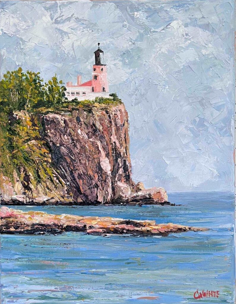
This is a very famous lighthouse that has been photographed many times, but the reference photo for this painting was taken by the husband of one of my dear friends. I’ve actually been to this place during my many Minnesota summers and loved how he captured it. It returned the memories of the lighter cool air, sounds of seagulls, and vivid blue sky and I was a child again on the rocky shore of Lake Superior.
Here’s the photo below taken by Dave Hudspith. He was a faithful follower of Jesus and a loving husband, father, and friend to many and has since gone to be present with the Lord. Appreciating the beautiful photos he left behind is just one small way of remembering him and giving God the glory for the gifts He bestowed in Dave.
During his Celebration of Life Service, I saw this photo and many others that he had taken. He was an excellent photographer. I was amazed by the photographs and also how everything about his service was grace-filled and celebratory of the life He lived for God. It was very different from any service I had ever witnessed.
When I saw this photo, I knew I had to paint it and give this painting to my friend. I appreciated the message of the lighthouse in the photo and how it is steady and firmly established on the edge of the cliff immovable and sure. Such a comfort in a time of loss when life feels unsteady, unsure, and out of our control.
None of us like the idea of death and many fear the pain of losing a loved one, but we will all experience it. The losses we experience and watch others experience around us bring so much pain and a feeling of being out of control that is so uncomfortable. Death is God’s final answer to man’s desire for control. He gives life and He takes it. No matter how we feel about that statement, it is true. We are fragile. He is strong. We are dependent on Him for our every breath. He is good. We are unsure and unsteady and God is like that lighthouse.
He says in Isaiah 41:10, Fear not, for I am with you; be not dismayed, for I am your God; I will strengthen you, I will help you, I will uphold you with my righteous right hand.
He is always there for us in our time of need and never waivers. He never promised we would not have sorrow or loss in this life, but He did say that He would be with us in the midst of it. I have found that to be true in my life as well. Painting this lighthouse was actually an act of worship of the God who I have found to be my always and enough.
Split Rock Lighthouse, Two Harbors, MN, 11×14, oil on canvas
While I was painting this, I thought about life and death and how little control we actually have about when we are born and when we die. I used to think my life was mine and I wrestled for control of everything. I considered life, my family, and my possessions as things I possessed… and if I possessed them, I had a right to control them… but now I think differently. I believe life, however long or short, is a gift from God that I just borrow for a while. It’s not mine, but it’s something I’m supposed to steward unto Him. Every moment I’m still here on this side of heaven is a gift from the Lord, so I want to celebrate it. It’s a daily choice I make to celebrate color, light, and life, in my relationships, my art business, and in this painting of Dave’s lighthouse. Enjoy!
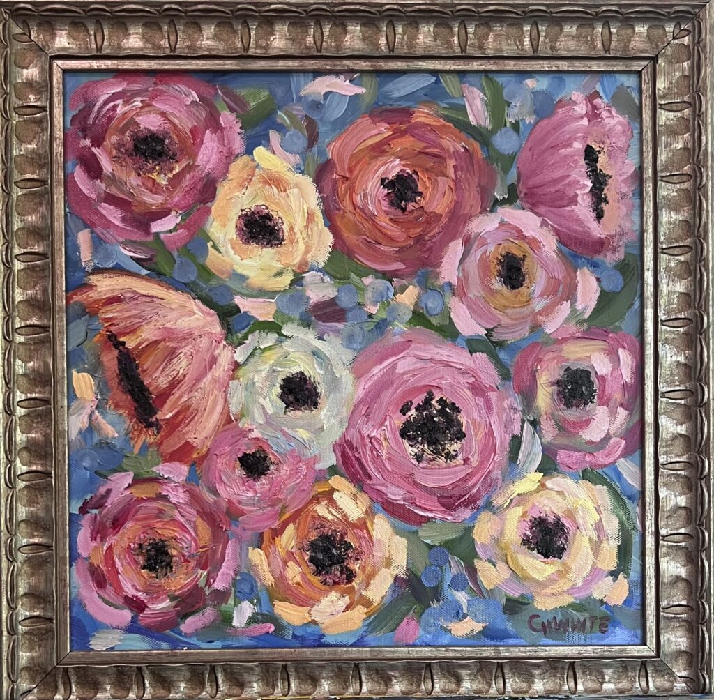
Celebrating Color, Light, and Life with this fun flower bloom painting. Done in oil on a 14″x14″ canvas and framed in a d 17×17″ frame, this delight makes my soul sing! Thick layers of impasto strokes create rich textured blooms with pops of light color notes and dark centers.
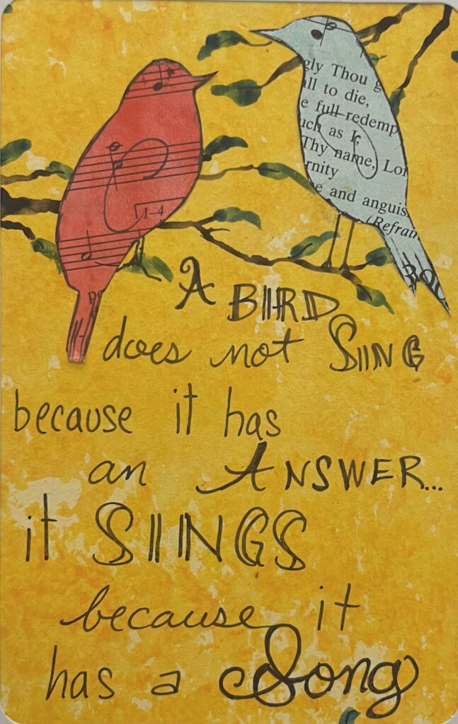
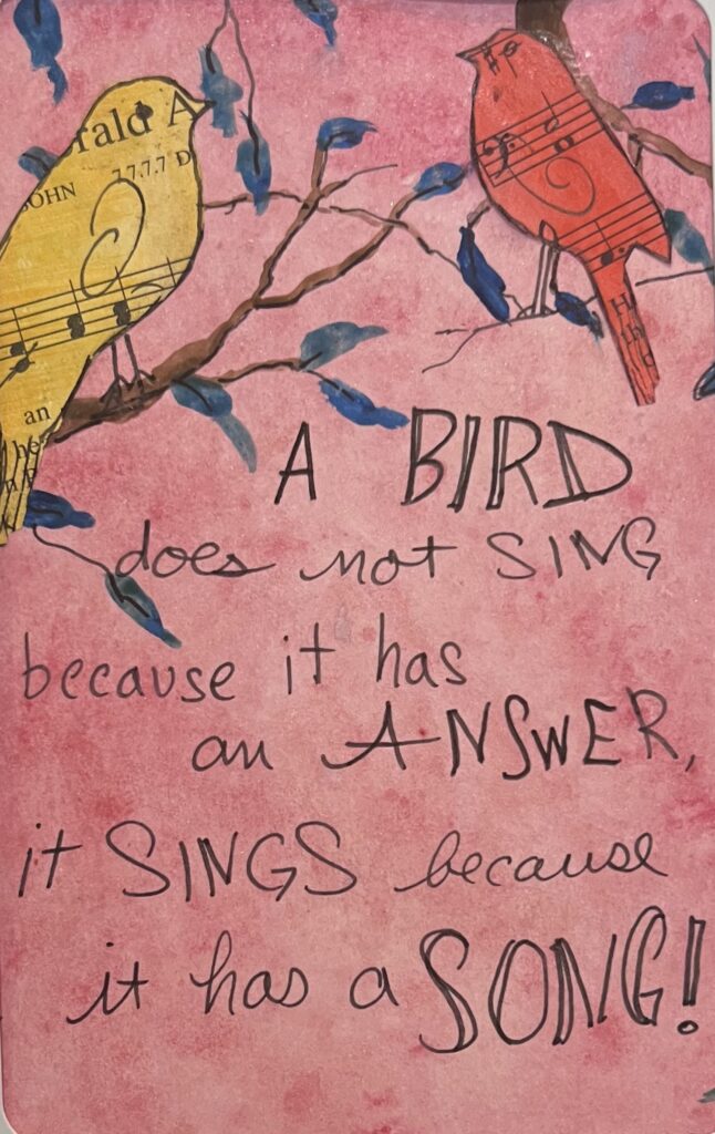
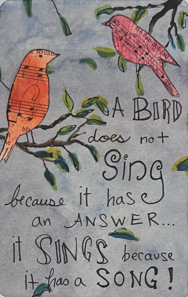
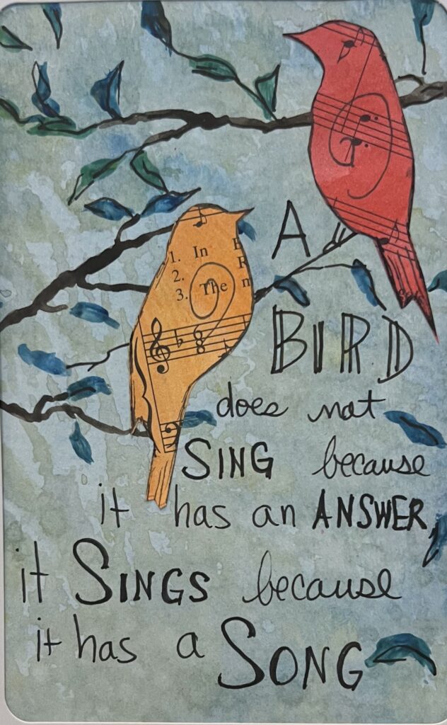
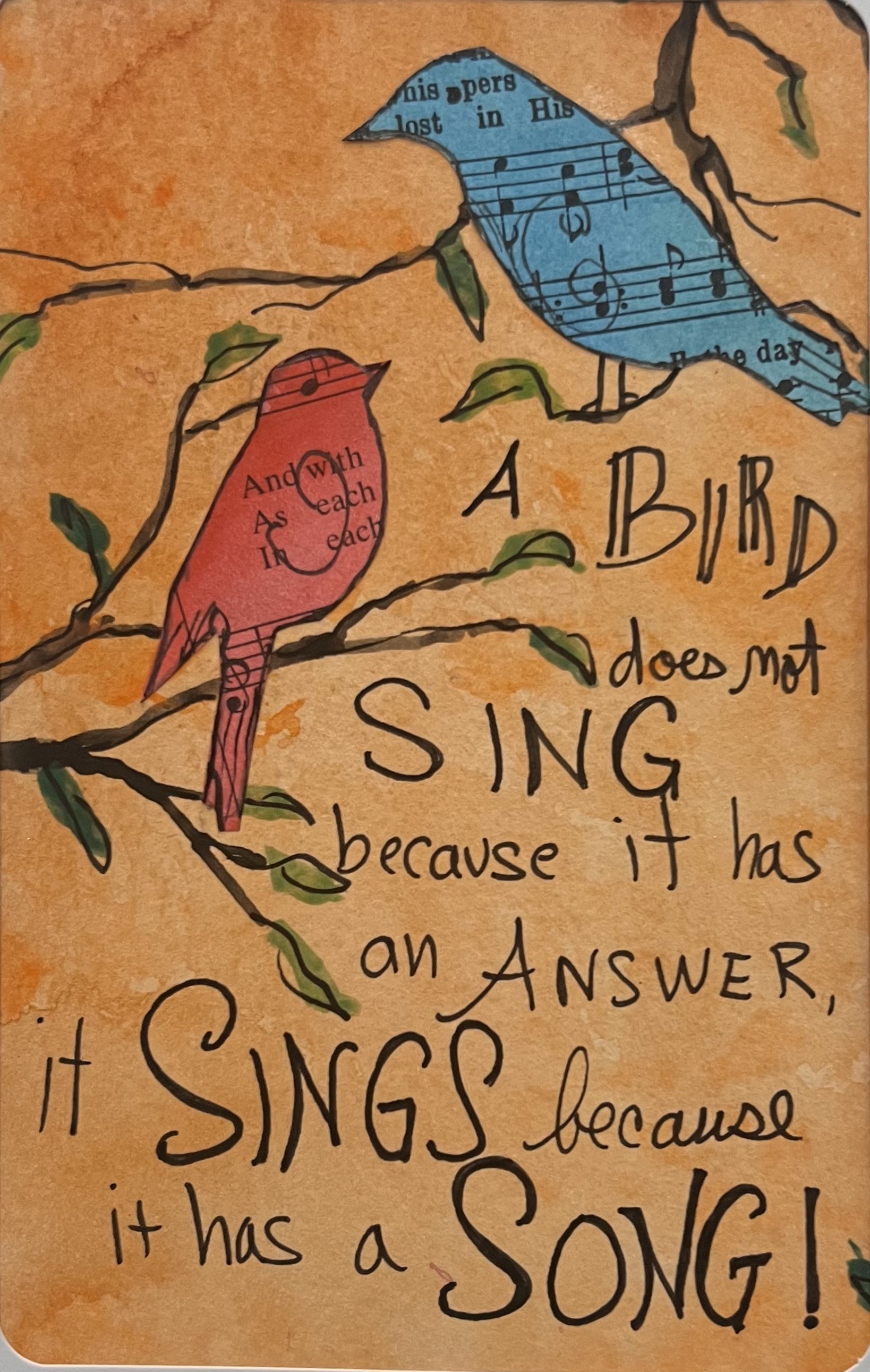
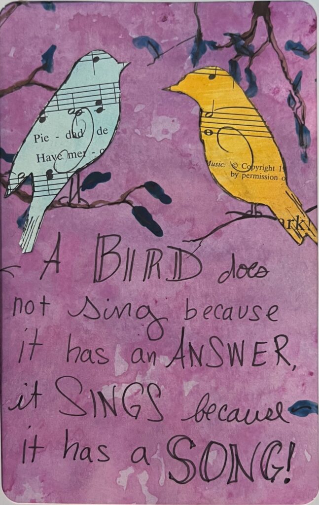
A bird does not sing because it has an answer…It sings because it has a song! The truth in this statement inspired me. I was doing art together with a friend one afternoon when she came across it. Instantly, I loved it and we both added it to the homemade cards we were making. We were using these sweet birds cut out of dyed hymn book pages. I promise I purchased the Hymnbook from a used bookstore. I didn’t just find it from a church. I love using pages from that book because the old thirsty paper soaks in the ink so well.
Birds and pens and glue in hand, we began to create our cards. They were a delight. I thought about the saying… How often do I want to just give an answer and why? To debate? To argue? To be right? To talk someone into my idea of what is right? No thanks. Instead, I would much rather use my voice to express the truth inside me… to share a song… hopefully a beautiful one. I’m not a singer, but I can sing with color, light, and life and let my art be my song. Here’s the result. Ten sweet 5×7″ handmade cards, ready for my next art show, or friend who needs the reminder that they too have a song to sing.
The process of creating this cards was also a reminder to me that even when I don’t have the answers I think I need, I do have a song. It’s a song of rest, of renewal and trust that Matthew 6:26-27 is true.
“26 Look at the birds of the air; they do not sow or reap or store away in barns, and yet your heavenly Father feeds them. Are you not much more valuable than they? 27 Can any one of you by worrying add a single hour to your life?”
I’m challenged by the birds. They don’t have all the answers about where their next meal will come from. How many seeds will they find to eat tomorrow? Where will they shelter in the next storm? We really are asking the same questions arn’t we? Will I be okay? Will I survive, thrive or flourish? God cares for their every need. They don’t have answers and they sing. I think my life would be a lot less stressful if I lived life a bit more like that.
This post is the story of how a painting blessed two families and was an answer to prayer. About 14 years ago, I painted Provision I in acrylic on a large canvas. It was inspired by the story from Matthew 14:13-21 where Jesus took two fish and five loaves and fed 5,000 people. This passage was very precious to me at the time because our family was going through a very tough financial period which God used to show us that He not only was Provider for the people in Jesus’s day, but he was also Provider for us here and now. This was a time when I struggled to buy canvases and paint supplies and we had to make many sacrifices financially. I painted the painting as an act of trust in the Lord. A woman from my church bought it! I was thrilled because it met some huge needs for us at the time, but the story didn’t stop there.
Provision 1 With the First Family
“Provision I” hung in her home for 14 years and was a constant reminder to her and her family that God is her provider as well. Through each trial, as they raised their children and journeyed through life this painting helped her remember that God is her provider in all things. This year, she contacted me because they were downsizing their home and selling most of their things. She wanted to know if I wanted the painting back. I accepted it and wondered what I would do with a 14-year-old painting. I don’t even paint in acrylic much now and prefer oils. I stuck it in the back of a closet and forgot about it.
Provision 1 Prayed For
During this same time, another family from my church kept expressing their enjoyment of my art and wanted to purchase a large painting. They came and visited my studio and nothing was affordable for them in the large size they wanted. They left empty-handed. This man had been praying for God to be His provider and sensed the Lord chasing after him with blessing. He was a man who trusted the Lord.
Provision 1 And the Second Family
Then I remembered the old “Provision I” painting in the tomb of my art closet. I fished it out and retouched some places on the painting and gave it new life and pop. I texted the original owner and let her know I found an opportunity to bless another family with her old painting and asked her permission to gift it to them. She was overjoyed that this painting would be going to a new home and be a reminder to a new family that God is our Provider. We gave the painting to this new family and they too received it with wonder and joy. It was larger and more colorful than any of the other paintings he had looked at and just what he wanted. Below is a picture of the painting in its new home.
Provision As An Answered Prayer
I felt like I was in the middle of a miracle and had a front-row seat as I watched God unfold each detail in the story. The first time I painted the painting, God showed me that He cares about my financial needs and is my Provider. Then while the first family owned the painting, God showed them that he is their provider for every Spiritual need and their Sustainer. Then when I got the painting back and was able to give it to someone else, God showed me that he orchestrates all things in His perfect timing and blesses us with opportunities to bless others. When the second family got the painting, God showed them that He delights in the prayers of His children and gives them the desires of their hearts. He truly is a God who chases after us with blessing. We just need to pay attention to His gentle invitations and trust Him.