How to Mix Vivid Purples
Mixing Purples Demo
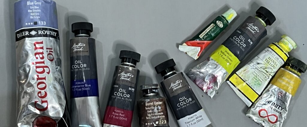
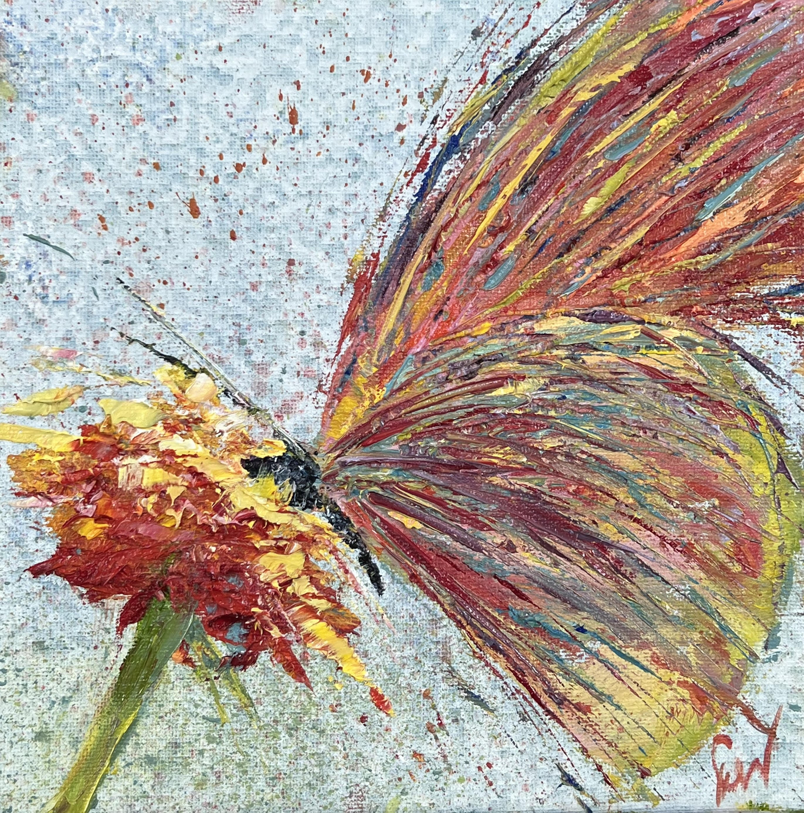
Red and Blue make purple….or do they? Do they always? Check out this quick one-minute demo below to find out. It shows the vivid purples resulting from mixing Ultramarine Blue with either Alizarine Crimson or Rose Red. And, (spoiler alert) it also shows the dull muddy color that results from combining Cadmium Red with Cerulean Blue.
Colors Lean
Ultramarine leans toward red on the color wheel and Cerulean leans closer to green. Alizarin Crimson leans toward blue and Cadmium Red leans away toward orange. Both Cadmium Red and Cerulean have a bit of yellow in them. On the color wheel below, it shows that yellow is complementary (or opposite) to Purple or Violet. Complementary colors tend to subdue or dull the mix. There are times in a painting this is needed, but if you are trying to get a vivid, deep, vibrant purple, you are better off with Alizarin and Ultramarine.
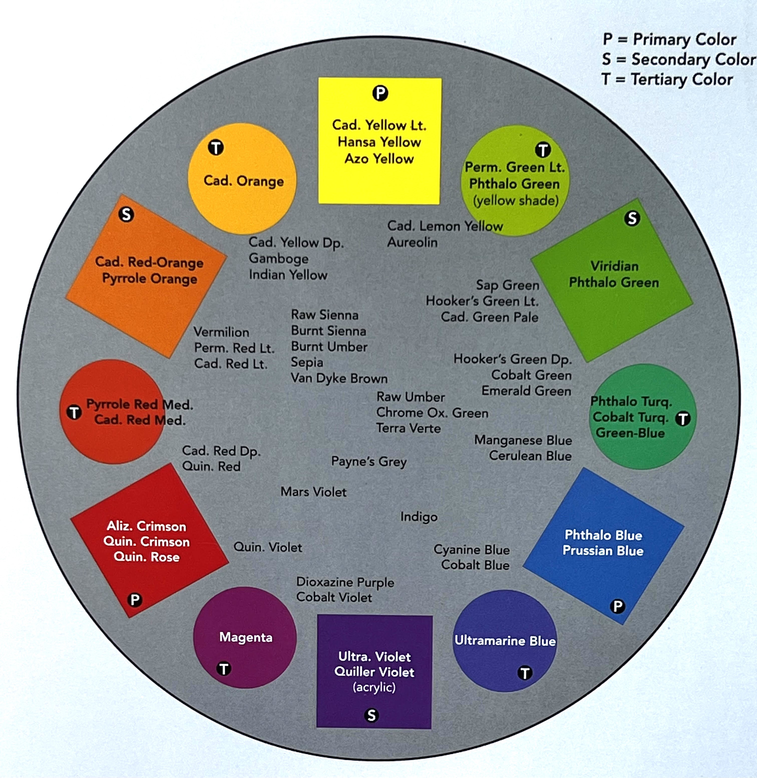
Most color wheels you buy from art supply stores are not going to have the actual tube paint names on them. They are helpful for understanding color theory. However, I prefer to just keep this “leaning colors” idea in my head while I am painting.
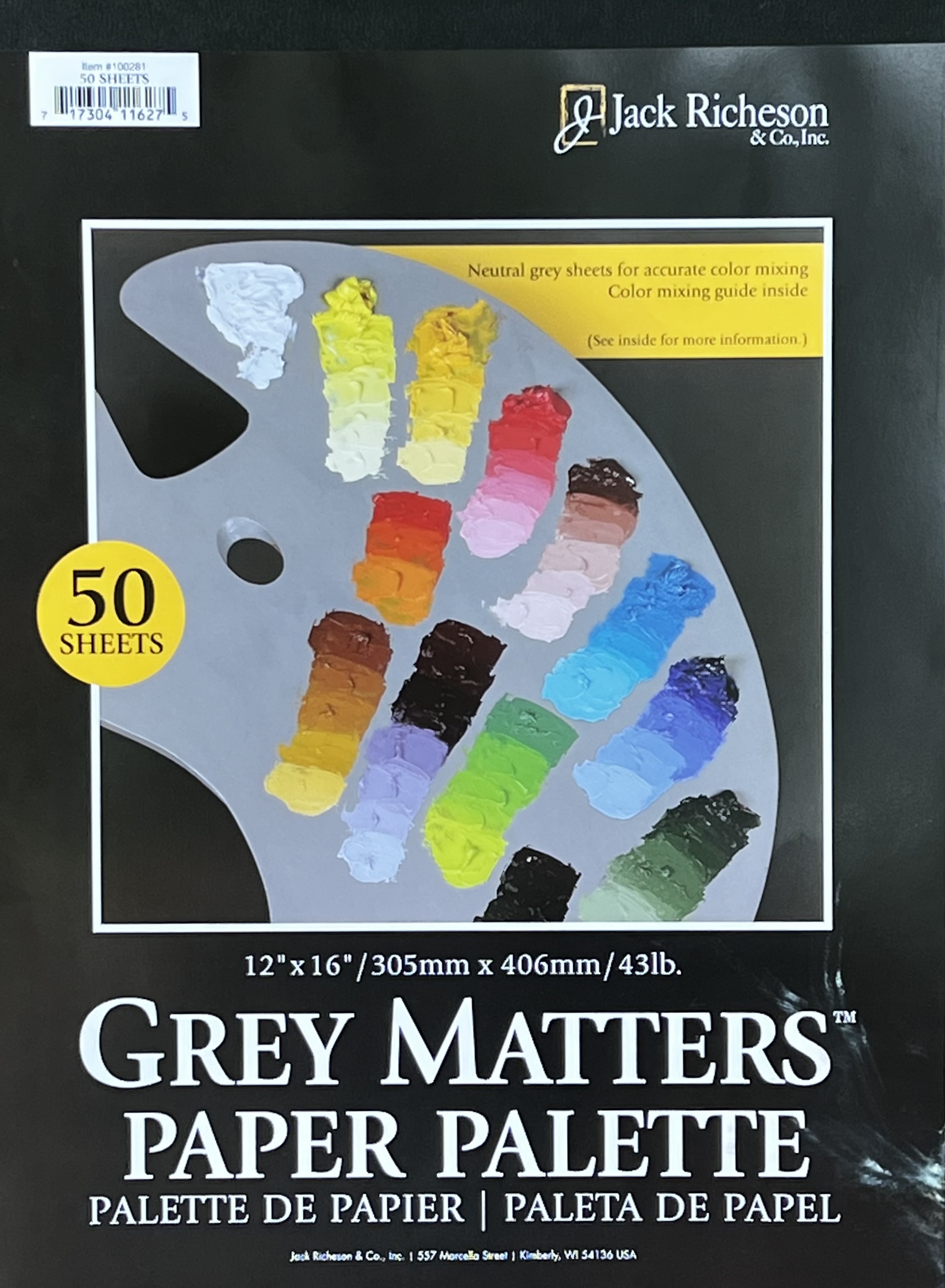
If you like the color wheel above, I actually got it for free in this disposable paint palette pad! I purchase the Grey Matters Paper Palette pads to mix my paint on and believe it or not this color wheel is on the inside cover of the pad. These are a great size for mixing paint on and toned grey to help you get the correct value in your mixes. I love the convenience of just being able to throw away my page from the pad when I am finished. Or, if I’m not finished, I can fold it up into a ziplock bag and save it in my refrigerator until I’m ready to paint the next day. You can find these at your favorite art supply store or in the link above on Amazon. It’s a great product with the perfect color tool included.
If you liked this, check out How to Mix A Variety of Greens.